Although we have endeavoured to specify exactly what Cascading style sheet (CSS) and JavaScript (JS) is required for each component we still recommend that you include all provided CSS and JS to ensure correct functionality, styling and browser support.
Common
Grid and layout
The Royal Society (RS) website is based upon a 12 column horizontal grid, with a maximum content area of 1225px. Column widths are set to 75px and gutters are fixed at 25px. The components in the RS website are sized to fit within this grid. Please make sure that when creating new components, you adhere to the same grid.
All components should also, where possible, conform to the grid as described on this page. All components should have a minimum vertical clearance of 22px from the components below or above, and a minimum horizontal clearance of 25px from the components to the left or to the right. Following these clearance and alignment rules will help to maintain readability and aesthetic appeal.
Most layouts within the RS website use a section element with a class of contentBox to create panels of content. A layout can be built using any number of these sections. Components and content can then be added to populate each section. Please see the example mark up for creating a section below.
There are a selection of helpful CSS classes that can help with layout. Please see below.
Class
Description
.left
Float an element to the left. Adds a CSS rule of "float: left;".
.right
Float an element to the right. Adds a CSS rule of "float: right;".
.clear
Clears an element. Adds a CSS rule of "clear: both;".
.fullClear
Clears an element and adds a width of 100%. Adds a CSS rules of "float: left; clear: both; width: 100%;".
.cf
Forces an element to self-clear its children. Adds psudeo elements for :before and :after with CSS rule of "content: " "; display: table;" and "clear: both;" for the :after element.
.fullWidth
Makes an element full width. Adds a CSS rule of "width: 100%;".
.halfWidth
Makes an element span half the width of its parent element. Adds a CSS rule of "width: 50%;".
.oneFifthWidth
Makes an element span 1/5th the width of its parent element. Adds a CSS rule of "width: 20%;".
.fourFifthWidth
Makes an element span 4/5th the width of its parent element. Adds a CSS rule of "width: 80%;".
.twoThirdWidth
Makes an element span 2/3rd the width of its parent element. Adds a CSS rule of "width: 65.9574468085%;".
.oneThirdWidth
Makes an element span 1/3rd the width of its parent element. Adds a CSS rule of "width: 34.0425531915%;".
.oneQuarterWidth
Makes an element span 1/4th the width of its parent element. Adds a CSS rule of "width: 25.5319148936%;".
.threeQuarterWidth
Makes an element span 3/4th the width of its parent element. Adds a CSS rule of "width: 74.4680851064%;".
.leftGutter
Adds 25px worth of gutter to the left side of an element. Adds a CSS rule of "padding-left: 25px;".
.rightGutter
Adds 25px worth of gutter to the right side of an element. Adds a CSS rule of "padding-right: 25px;".
.topGap
Adds 22px worth of space to the top of an element. Adds a CSS rule of "margin-top: 22px;".
.bottomGap
Adds 22px worth of space to the bottom of an element. Adds a CSS rule of "margin-bottom: 22px;".
.halfTopGap
Adds 11px worth of space to the top of an element. Adds a CSS rule of "margin-top: 11px;".
.halfBottomGap
Adds 11px worth of space to the bottom of an element. Adds a CSS rule of "margin-bottom: 11px;".
.doubleBottomGap
Adds 44px worth of space to the bottom of an element. Adds a CSS rule of "margin-bottom: 44px;".
.doubleTopGap
Adds 44px worth of space to the top of an element. Adds a CSS rule of "margin-top: 44px;".
Colour
Please see below the core colours used within the RS website.
Red background-color: #ba0c2f
Usage
Used throughout the site to indicate important areas of interest and interactive elements such as navigation, active/hover states, links and calls to action.
Stone background-color: #d6d2c4
Usage
Interactive elements such as filter groups and inactive tabs. Also used for descriptive information on journal cards.
Stone (light shade) background-color: #e8e6df
Usage
Page background.
Charcoal background-color: #333132
Usage
Headings, body text and the background colour for selected additional information areas such as grant opening dates and event series. Also used as the background for mobile-specific user interface elements such as "related events" and "event organisers".
Plum background-color: #6f263d
Usage
Alternate call to action background colour, often used where red would be too strong or a lower level of prominence is required. Example uses include Rolodex, table headers and event card date fields.
Warm grey background-color: #aca2a0
Usage
Used primarily for the heading area of grant cards. Also used for icons such as blog date and the footer "back to top" icon.
Warm grey (light shade) background-color: #e0dcdb
Usage
Event schedule headers, content page features (such as grant application information on grant content detail pages) and table cells.
Journal card colours
Green background-color: #55ba46
Usage
Used for journals covering biological sciences.
Blue background-color: #0093d0
Usage
Used for journals covering physical sciences.
Purple background-color: #e8e6df
Usage
Used for cross-disciplinary journals.
Warm grey background-color: #938884
Usage
Used for journals covering the history of science.
The Royal Society is a self-governing Fellowship made up of the most eminent scientists, engineers and technologists from the UK and the Commonwealth. Fellows and Foreign Members are elected for life through a peer review process on the basis of excellence in science. (p)
There are approximately 1,600 Fellows and Foreign Members, including around 80 Nobel Laureates. Each year up to 52 Fellows and up to 10 Foreign Members are elected from a group of around 700 candidates who are proposed by the existing Fellowship. (p, strong)
Tim Bliss is a neuroscientist whose work has done much to provide a neural explanation for learning and memory. (p, em)
I want to let you know what a pleasure it was to publish my manuscript in Open Biology. These days it is hard to find a journal that is open to publishing ideas and is both fast and fair, but Open Biology offers exactly that! The sooner work is published the better so I will certainly consider Open Biology again for future articles. Thank you for being on my (and science’s) side!
							<div class="rteContent">
								<h1>Typography</h1>
								<hr>
								<h1>Fellowshop Directory (h1)</h1>
								<h2>Fellows in the news (h2)</h2>
								<h3>Journals (h3)</h3>
								<h4>Collections (h4)</h4>
								<h1 class="semi">Fellowshop Directory (h1, subheading)</h1>
								<h2 class="semi">Fellows in the news (h2, subheading)</h2>
								<h3 class="semi">Journals (h3, subheading)</h3>
								<h4 class="semi">Collections (h4, subheading)</h4>
								<h1><a href="#">Fellowshop Directory (h1, link)</a></h1>
								<h2><a href="#">Fellows in the news (h2, link)</a></h2>
								<h3><a href="#">Journals (h3, link)</a></h3>
								<h4><a href="#">Collections (h4, link)</a></h4>
								<p>The Royal Society is a self-governing Fellowship made up of the most eminent scientists, engineers and technologists from the UK and the Commonwealth. Fellows and Foreign Members are elected for life through a peer review process on the basis of excellence in science. (p)</p>
								<p>There are approximately 1,600 Fellows and Foreign Members, including around <strong>80 Nobel Laureates</strong>. Each year up to 52 Fellows and up to 10 Foreign Members are elected from a group of around 700 candidates who are proposed by the existing Fellowship. (p, strong)</p>
								<p>Tim Bliss is a <em>neuroscientist</em> whose work has done much to provide a neural explanation for learning and memory. (p, em)</p>
								<p>With Professors <a href="#">Richard Morris</a> and <a href="#">Graham Collingridge</a> he won the prestigious <a href="#">Brain Prize</a> for their "outstanding contribution to European neuroscience" (p, a).</p>
								<h3>Unordered list</h3>
								<ul class="listUL">
									<li>A list item (li)</li>
									<li>A list item (li)</li>
									<li>A list item (li)</li>
								</ul>
								<h3>Ordered list</h3>
								<ol>
									<li>A list item (li)</li>
									<li>A list item (li)</li>
									<li>A list item (li)</li>
								</ol>
								<blockquote class="quote bottomGap">
									<p class="icon iconQuoteLeft bottomGap">I want to let you know what a pleasure it was to publish my manuscript in Open Biology. These days it is hard to find a journal that is open to publishing ideas and is both fast and fair, but Open Biology offers exactly that! The sooner work is published the better so I will certainly consider Open Biology again for future articles. Thank you for being on my (and science’s) side!</p>
									<footer class="icon iconQuoteRight">Dr James D. Watson ForMemRS, Cold Spring Harbor Laboratory, USA</footer>
								</blockquote>
							</div>
Icons
The following icons are available to use within the RS build. These icons are available as an icon font using either the pseudo :after or :before element to render them on the page.
Examples
Please see coded examples below. Each icon class uses either a :before or :after pseudo element to add the icon. As you can see each icon has been coloured and sized to be fit for its particular purpose. Therefore, if you wish use the icons at a different size or colours you will need to write new CSS classes.
							<span class="icon iconKey left rightGutter"></span>
							<span class="icon iconSearch left rightGutter"></span>
							<span class="icon iconArrowUp left rightGutter"></span>
							<span class="icon iconArrowDown left rightGutter"></span>
							<span class="icon iconArrowLeft left rightGutter"></span>
							<span class="icon iconArrowRight left rightGutter"></span>
Codes
The following codes can be put into content attribute of the pseudo element to produce the desired icon.
Icon
Code
Menu
\e600
Search
\e601
Key
\e602
Flip
\e603
Navigate up
\e604
Navigate down
\e605
Arrow up
\e608
Arrow down
\e609
Navigation left
\e606
Navigation right
\e607
Arrow left
\e60a
Arrow right
\e60b
Filter
\e60c
Quote left
\e60d
Quote right
\e60e
Phone
\e60f
Email
\e610
Play
\e612
Tick
\e616
External
\e615
RSS
\e614
Plus
\e617
Pdf
\e618
Xls
\e619
Word
\e61a
Facebook
\e61b
Twitter
\e61c
Youtube
\e611
GooglePlus
\e61d
LinkedIn
\e61f
Pinterest
\e620
Instagram
\e61e
Imagery
Please see below a list of all images used for the components listed in this pattern library. The list also includes other information (ratio cropped and recommended upload size) which are only required if you decide to use an image hander in your solution combined with imageSizes.js plugin.
Please note: For example implementation of the image handler and imageSizes.js solution please see the Redweb (RW) build.
Image information
Location/Name
Displayed size
Ratio cropped
Features
Grants & Awards Feature - Large image
375px x 300px
Three quarter ratio
Grants & Awards Feature - Small image
175px x 140px
Three quarter ratio
Journals large feature image
775px x 374px
Half ratio
Venue hire feature small image
294px x 141px
Half ratio
Venue hire feature large image
688px x 284px
Half ratio
Event feature - large image
375px x 300px
Three quarter ratio
Event feature - small image
175px x 140px
Three quarter ratio
Cards
Fellow card image
175px x 175px
No ratio
Event card image
275px x 220px
Four fifth ratio
Grant/Award card image
275px x 220px
Four fifth ratio
Blog post card image
275px x 176px
Two third ratio
Video podcast card image
275px x 176px
Two third ratio
People card image
300px x 229px
Three quarter ratio
Journal card image
275px x 220px
Four fifth ratio
Committee card image
175px x 140px
Four fifth ratio
Medallist card image
175px x 175px
No ratio
Other
Search result listing image
176px x 113px
Two third ratio
Rolodex image
1175px x 396px
No ratio
Event organisers image
175px x 175px
No ratio
Homepage feature image
600px x 308px
No ratio
About us spotlight image
600px x 290px
Half ratio
Topic grid image
275px x 176px
Two third ratio
Gallery bar image
275px x 275px
No ratio
Tables
Please see an example table below. Tables in the RS build adapt responsively in the manner described in Google fundamentals library.
Example
Cookie name
Purpose
Type
Details
acceptsCookies/Access, cks
Site cookie acceptance. These cookies are used to record if the end user's browser accepts the use of cookies
session
Strictly necessary for login and pay-per-view activities. Usually this will not be used unless the end user requests a service that makes use of cookies. Info held: text string 'true'.
foxycart, cme, personify
For ecommerce solutions
Site cookie, defined time interval
These cookies are required for control flow between Drupal and the e-commerce providers to reload cart, to make login attempts, to keep transaction session.
highwire_alerts_user_email
For storing user email for alerts, if user is not logged in and wants to subscribe to alerts
								<!-- Table -->
								<table>
									<tbody>
										<tr>
											<th>
												Cookie Name
											</th>
											<th>
												Purpose
											</th>
											<th>
												Type
											</th>
											<th>
												Details
											</th>
										</tr>
										<tr>
											<td data-th="Cookie Name">
												acceptsCookies/Access, cks
											</td>
											<td data-th="Purpose">
												Site Cookie Acceptance. These cookies are used to record if the end user's browser accepts the use of cookies
											</td>
											<td data-th="Type">
												session
											</td>
											<td data-th="Details">
												Strictly necessary for login and pay-per-view activities. Usually this will not be used unless the end user requests a service that makes use of cookies. Info held: text string 'true'.
											</td>
										</tr>
										<tr>
											<td data-th="Cookie Name">
												foxycart, cme, personify
											</td>
											<td data-th="Purpose">
												For ecommerce solutions
											</td>
											<td data-th="Type">
												Site Cookie, defined time interval
											</td>
											<td data-th="Details">
												These cookies are required for control flow between Drupal and the e-commerce providers to reload cart, to make login attempts, to keep transaction session.
											</td>
										</tr>
										<tr>
											<td data-th="Cookie Name">
												highwire_alerts_user_email
											</td>
											<td data-th="Purpose">
												For storing user email for alerts, if user is not logged in and wants to subscribe to alerts
											</td>
											<td data-th="Type">
												Site Cookie, defined time interval
											</td>
											<td data-th="Details">
												Will hold email address only.
											</td>
										</tr>
									</tbody>
								</table>
High
Filters
Description
Filters are used throughout the RS website in sections including the fellow search, awards search and grants search. In the RW build the majority of Filters are populated through a GET/POST request to a backend ASP.NET WEB Application Programming Interface (API) JSON service.
Required CSS
css/main.css - incudes the main CSS styles for the Filters.
css/modular.css - includes any modular, reusable CSS rules like .fullWidth, .left and .fullClear which are used for the Filters.
css/print.css - includes any print specific CSS styles that are used for the Filters.
css/responsive.css - includes responsive CSS styles for the Filters.
Required JavaScript
jquery.min.js - jQuery version 1.11.1 referenced externally.
js/page.js - contains JS required for Filters including a IE10 styled select fix and also functionality needed for the filter reveal on filter button click.
js/main.js - contains the main site JS.
js/interact.1.0.0.js - dependency required for page.js and main.js.
js/core.1.0.1.js - dependency required for page.js and main.js.
js/respond.min.js - min/max-width media query polyfill for older versions of IE.
Data dependencies
No dependencies. Filter population will be down to RS implementation and solution.
Filter types
See below the four core filter types with working examples and mark up examples.
Please note: The data attribute called data-revealedcontentid is used to reference the ID of the element that should open when the button is clicked.
Example text search with autocomplete. Please note this filter will rely on a backend service to supply autocomplete data therefore we have mocked up how this would appear. There can also be an optional button shown in the open state, example below.
The significant change for the Filters happens at 730px. The filters then stay the same apart from minor changes all the way down to lowest viewport (320px). Please see screenshots of before and after below.
The Search result listing in the RW build has a high level of dependency on AngularJS. In the example below all AngularJS markup has been stripped out to show the bare HTML and CSS needed to style the Search result listing. Functionality will be down to RS implementation and solution. The Search result listing comprises of a search box to either amend or begin a search, a grouped button element which updates the category of listings being displayed, a selection of filters, sort options and a clear filters button.
05 February 2015 - Open data is data that is freely available to anyone to access, use and share. Open data affects the way research is conducted and communicated, with …
05 February 2015 - Open data is data that is freely available to anyone to access, use and share. Open data affects the way research is conducted and communicated, with …
05 February 2015 - Open data is data that is freely available to anyone to access, use and share. Open data affects the way research is conducted and communicated, with …
05 February 2015 - Open data is data that is freely available to anyone to access, use and share. Open data affects the way research is conducted and communicated, with …
05 February 2015 - Open data is data that is freely available to anyone to access, use and share. Open data affects the way research is conducted and communicated, with …
05 February 2015 - Open data is data that is freely available to anyone to access, use and share. Open data affects the way research is conducted and communicated, with …
05 February 2015 - Open data is data that is freely available to anyone to access, use and share. Open data affects the way research is conducted and communicated, with …
05 February 2015 - Open data is data that is freely available to anyone to access, use and share. Open data affects the way research is conducted and communicated, with …
05 February 2015 - Open data is data that is freely available to anyone to access, use and share. Open data affects the way research is conducted and communicated, with …
05 February 2015 - Open data is data that is freely available to anyone to access, use and share. Open data affects the way research is conducted and communicated, with …
							<!-- Search result listing -->
								<section id="mainSiteSearch" class="contentBox bottomGap cf">
									<section class="largeSearch bottomGap cf">
										<label for="searchBox" class="left largeLabel tripleLine rightGutter noMargin">Results for:</label>
										<article class="threeQuarterWidth left">
											<a class="btn btnJoined right big icon iconSearch" href=""><span class="offScreen">Search</span></a>
											<div class="media">
												<input name="searchBox" type="text" id="searchBox" class="textbox textboxJoined fullWidth left big" placeholder="Search term">
											</div>
										</article>
									</section>
									<p>Show results in:</p>
									<section class="resultsFilter doubleBottomGap">
										<ul class="inlineList cf">
											<li><a href="" class="capitalise active">main website</a></li>
											<li><a href="" class="capitalise">image library</a></li>
											<li><a href="" class="capitalise">blogs</a></li>
											<li><a href="" class="capitalise icon iconExternalLink">journals</a></li>
										</ul>
									</section>
									<div class="resultsFilterSelect styledSelect doubleBottomGap" hidden="hidden">
										<label for="searchArea" hidden="hidden">Select search area:</label>
										<select id="searchArea">
											<option value="0" selected="selected" label="main website">main website</option>
											<option value="1" label="image library">image library</option>
											<option value="2" label="blogs">blogs</option>
											<option value="3" label="journals">journals</option>
										</select>
									</div>
									<a class="reveal filter icon iconFilters" href="#" data-revealedcontentid="searchResultFilters" data-unrevealedtext="Show filters" data-revealedtext="Hide filters">Show filters</a>
									<a class="largeText right icon iconCross clearFilters" href="">Clear filters</a>
									<div id="searchResultFilters" class="revealedContent searchOptions bottomGap fullClear" hidden="hidden">
										<a class="reveal filter expandFilters icon" href="#" data-revealedcontentid="contentTypeFilters">Content type</a>
										<a class="reveal filter expandFilters icon largeScreenFilter" href="#" data-revealedcontentid="topicFilters">Topic</a>
										<a class="reveal filter expandFilters icon largeScreenFilter" href="#" data-revealedcontentid="scientificAreaFilters">Scientific area</a>
										<a class="reveal filter expandFilters icon largeScreenFilter" href="#" data-revealedcontentid="pictureFilters">Pictures</a>
										<a class="reveal filter expandFilters icon largeScreenFilter" href="#" data-revealedcontentid="blogFilters">Blogs</a>
										<div id="contentTypeFilters" class="revealedContent searchOptions fullClear" hidden="hidden">
											<div class="filterContainer left">
												<div class="left">
													<input id="contentTypeall" type="radio" name="contentType" value="all">
													<label for="contentTypeall" class="capitalise ">all</label>
												</div>
												<div class="left">
													<input id="contentTypefellows" type="radio" name="contentType" value="fellows">
													<label for="contentTypefellows" class="capitalise">fellows</label>
												</div>
												<div class="left">
													<input id="contentTyperesearch" type="radio" name="contentType" value="research fellows">
													<label for="contentTyperesearch" class="capitalise">research fellows</label>
												</div>
												<div class="left">
													<input id="contentTypeevents" type="radio" name="contentType" value="events">
													<label for="contentTypeevents" class="capitalise ">events</label>
												</div>
												<div class="left">
													<input id="contentTypegrants" type="radio" name="contentType" value="grants">
													<label for="contentTypegrants" class="capitalise">grants</label>
												</div>
												<div class="left">
													<input id="contentTypeawards" type="radio" name="contentType" value="awards">
													<label for="contentTypeawards" class="capitalise">awards</label>
												</div>
												<div class="left">
													<input id="contentTypepolicy reports" type="radio" name="contentType" value="policy reports">
													<label for="contentTypepolicy reports" class="capitalise">policy reports</label>
												</div>
												<div class="left">
													<input id="contentTypenews" type="radio" name="contentType" value="news">
													<label for="contentTypenews" class="capitalise">news</label>
												</div>
												<div class="left">
													<input id="contentTypejournal news" type="radio" name="contentType" value="journal news">
													<label for="contentTypejournal news" class="capitalise">journal news</label>
												</div>
											</div>
											<a class="goToResults btn btnRounded right" href="#">Show results</a>
										</div>
										<a class="reveal filter expandFilters icon smallScreenFilter" href="#" data-revealedcontentid="topicFilters" hidden="hidden">Topic</a>
										<div id="topicFilters" class="revealedContent searchOptions fullClear" hidden="hidden">
											<label class="mediumLabel left" for="topicFilter">Topic:</label>
											<div class="styledSelect left">
												<select id="topicFilter">
													<option value="" class="">Select topic</option>
													<option value="0" label="Agriculture and food">Agriculture and food</option>
													<option value="1" label="Diversity in science">Diversity in science</option>
													<option value="2" label="Economy and development">Economy and development</option>
													<option value="3" label="Education and skills">Education and skills</option>
													<option value="4" label="Energy, environment and climate">Energy, environment and climate</option>
													<option value="5" label="Ethics and conduct">Ethics and conduct</option>
													<option value="6" label="Funding, governance and careers">Funding, governance and careers</option>
													<option value="7" label="Health and wellbeing">Health and wellbeing</option>
													<option value="8" label="Industry and innovation">Industry and innovation</option>
													<option value="9" label="New and emerging technology">New and emerging technology</option>
													<option value="10" label="Open science and data">Open science and data</option>
													<option value="11" label="Security and risk">Security and risk</option>
												</select>
											</div>
											<a class="goToResults btn btnRounded right" href="#">Show results</a>
										</div>
										<a class="reveal filter expandFilters icon smallScreenFilter" href="#" data-revealedcontentid="scientificAreaFilters" hidden="hidden">Scientific
												area</a>
										<div id="scientificAreaFilters" class="revealedContent searchOptions fullClear" hidden="hidden">
											<div class="filterContainer left">
												<div class="left">
													<input id="4f53cc4d-6808-41c2-adcf-85232413acca" type="checkbox" value="4f53cc4d-6808-41c2-adcf-85232413acca">
													<label for="4f53cc4d-6808-41c2-adcf-85232413acca">Anatomy, physiology and neurosciences</label>
												</div>
												<div class="left">
													<input id="9ba35fdc-bc74-4a12-af20-8db6a906fd8b" type="checkbox" value="9ba35fdc-bc74-4a12-af20-8db6a906fd8b">
													<label for="9ba35fdc-bc74-4a12-af20-8db6a906fd8b">Astronomy and physics</label>
												</div>
												<div class="left">
													<input id="73845f8a-8984-47ae-8be6-52e66f5d111d" type="checkbox" value="73845f8a-8984-47ae-8be6-52e66f5d111d">
													<label for="73845f8a-8984-47ae-8be6-52e66f5d111d">Biochemistry and molecular cell biology</label>
												</div>
												<div class="left">
													<input id="9979e649-c243-4753-9a03-31b445f70af9" type="checkbox" value="9979e649-c243-4753-9a03-31b445f70af9">
													<label for="9979e649-c243-4753-9a03-31b445f70af9">Chemistry</label>
												</div>
												<div class="left">
													<input id="9e7aab0e-9a35-46c9-9f0e-ee18ecaad8c1" type="checkbox" value="9e7aab0e-9a35-46c9-9f0e-ee18ecaad8c1">
													<label for="9e7aab0e-9a35-46c9-9f0e-ee18ecaad8c1">Earth and environmental sciences</label>
												</div>
												<div class="left">
													<input id="be4d0851-6d44-4dac-8be0-7242eb5fdd69" type="checkbox" value="be4d0851-6d44-4dac-8be0-7242eb5fdd69">
													<label for="be4d0851-6d44-4dac-8be0-7242eb5fdd69">Engineering</label>
												</div>
												<div class="left">
													<input id="a3654dcb-d1e2-4099-8b59-b280bf57ef6f" type="checkbox" value="a3654dcb-d1e2-4099-8b59-b280bf57ef6f">
													<label for="a3654dcb-d1e2-4099-8b59-b280bf57ef6f">Health and human sciences</label>
												</div>
												<div class="left">
													<input id="a5bdf90e-e3f1-45c3-b5cb-d3070bf7f688" type="checkbox" value="a5bdf90e-e3f1-45c3-b5cb-d3070bf7f688">
													<label for="a5bdf90e-e3f1-45c3-b5cb-d3070bf7f688">Mathematics</label>
												</div>
												<div class="left">
													<input id="5f887e22-2ad1-45d9-9f6a-0a5b676715cf" type="checkbox" value="5f887e22-2ad1-45d9-9f6a-0a5b676715cf">
													<label for="5f887e22-2ad1-45d9-9f6a-0a5b676715cf">Microbiology, immunology and developmental biology</label>
												</div>
												<div class="left">
													<input id="95eee960-f7e0-4d03-abe8-3173a50e967f" type="checkbox" value="95eee960-f7e0-4d03-abe8-3173a50e967f">
													<label for="95eee960-f7e0-4d03-abe8-3173a50e967f">Organismal biology, evolution and ecology</label>
												</div>
											</div>
											<a class="goToResults btn btnRounded right" href="#">Show results</a>
										</div>
										<a class="reveal filter expandFilters icon smallScreenFilter" href="#" data-revealedcontentid="pictureFilters" hidden="hidden">Pictures</a>
										<div id="pictureFilters" class="revealedContent searchOptions fullClear" hidden="hidden">
											<div class="filterContainer left">
												<div class="left">
													<input id="allPictures" type="radio" name="pictureOptions" value="001960491642182434533:_46i2wt1yxw">
													<label for="allPictures">All</label>
												</div>
												<div class="left">
													<input id="commercialPictures" type="radio" name="pictureOptions" value="001960491642182434533:col3z0sniis">
													<label for="commercialPictures">Pictures for commercial licensing</label>
												</div>
												<div class="left">
													<input id="framedPrints" type="radio" name="pictureOptions" value="001960491642182434533:q0-xlcguxtu">
													<label for="framedPrints">Framed prints for display</label>
												</div>
											</div>
											<a class="goToResults btn btnRounded right" href="#">Show results</a>
										</div>
										<a class="reveal filter expandFilters icon smallScreenFilter" href="#" data-revealedcontentid="blogFilters" hidden="hidden">Blogs</a>
										<div id="blogFilters" class="revealedContent searchOptions fullClear" hidden="hidden">
											<div class="filterContainer left">
												<div class="left ng-scope">
													<input id="allBlogs" type="radio" name="blogOptions" value="001960491642182434533:qivllnjcpaw">
													<label for="allBlogs">All</label>
												</div>
												<div class="left ng-scope">
													<input id="inVerbaBlog" type="radio" name="blogOptions" value="001960491642182434533:6psxys4t0z4">
													<label for="inVerbaBlog">In Verba</label>
												</div>
												<div class="left ng-scope">
													<input id="repositoryBlog" type="radio" name="blogOptions" value="001960491642182434533:ch8s6obqb-o">
													<label for="repositoryBlog">The Repository</label>
												</div>
												<div class="left ng-scope">
													<input id="insideScienceBlog" type="radio" name="blogOptions" value="001960491642182434533:cfzubirhvzs">
													<label for="insideScienceBlog">Inside Science</label>
												</div>
												<div class="left ng-scope">
													<input id="publishingBlog" type="radio" name="blogOptions" value="001960491642182434533:d_pwfmqwyam">
													<label for="publishingBlog">Royal Society Publishing Blog</label>
												</div>
											</div>
											<a class="goToResults btn btnRounded right" href="#">Show results</a>
										</div>
									</div>
									<hr id="searchResultsAnchor" class="fullClear noMargin invisible">
									<section class="bottomGap fullClear">
										<strong class="largeText inlineLabel left">Sort by:</strong>
										<div class="left">
											<div class="left">
												<input id="sortRelevance" type="radio" name="sortBy" value="relevance">
												<label class="inlineLabel" for="sortRelevance">Relevance</label>
											</div>
											<div class="left">
												<input id="sortDate" type="radio" name="sortBy" value="date">
												<label class="inlineLabel" for="sortDate">Date</label>
											</div>
										</div>
									</section>
									<p class="largeText fullClear" style="display: none;">Please enter a search term</p>
									<ul class="resultList fullClear">
										<li class="bottomGap cf">
											<div class="searchResultImage left">
												<div class="lazyLoad twoThirdRatio">
													<noscript data-src="img/placeholder/resultListing.jpg" data-alt="The Royal Society crest">
														<img src="img/placeholder/resultListing.jpg" alt="The Royal Society crest" />
													</noscript>
												</div>
											</div>
											<div class="twoThirdWidth media leftGutter">
												<h4 class="semi"><a href="/topics-policy/open-science-and-data">Open science and data</a></h4>
												<p><strong>05 February 2015</strong>
													<span> - <span>Open data is data that is freely available to anyone to access, use and share. Open data affects the way research is conducted and communicated, with …</span></span>
												</p>
											</div>
										</li>
									</ul>
									<hr class="fullClear">
									<div class="moreResults cf">
										<p class="additionalSearchInfo largeText">9469 results</p>
										<p class="largeText alignCenter"><a href="" class=""><span class="icon iconArrowDown">Show more results</span></a></p>
										<p class="additionalSearchInfo largeText alignRight">Show <a href="">10</a> | <a href="">20</a> | <a href="">50</a> | <a href="">100</a></p>
									</div>
								</section>
Required CSS
css/main.css - includes the main CSS styles for the Search result listing.
css/responsive.css - includes the responsive CSS styles for the Search result listing.
css/modular.css - includes any reusable CSS rules like .noMargin, .right and .cf that are used for the search result listing.
css/print.css - includes any print specific CSS styles that are used for the search result listing.
Required JavaScript
jquery.min.js - jQuery version 1.11.1 referenced externally.
js/page.js - contains JS required for filters including a IE10 styled select fix and also functionality needed for the filter reveal on filter button click.
js/main.js - includes the JS for functionality/mobile changes.
js/interact.1.0.0.js - dependency required for page.js and main.js.
js/core.1.0.1.js - dependency required for page.js and main.js.
js/respond.min.js - min/max-width media query polyfill for older versions of IE.
js/ie8.js - JS polyfills and fallbacks for CSS items that lack IE8 support.
Significant responsive state changes
The significant changes for the Search result listing happen at 950px and 730px. The Search result listing then stays the same apart from minor changes all the way down to lowest viewport (320px). Please see screenshots of before and after below.
In the RW build the Search result listing depends heavily on AngularJS for functionality. It pulls data from internal APIs and Google Custom Search API. RW have provided all necessary HTML and CSS and functionality and data population will be down to RS implementation and solution.
Alerts are shown in the eFellows section of the site. They include a title, link and expiry date. They also have a cross which can be used to dismiss the alert once it has been read by the user.
Example
Alerts
A line of text putting these important updates into context.
							<!-- Alerts -->
							<section class="contentBox bottomGap cf">
								<h2>Alerts</h2>
								<p>A line of text putting these important updates into context.</p>
								<div class="colList threeCol">
									<article class="col noMargin fellowAlert cf" data-guid="4e198c9c-a943-4105-a861-9a8b7c72b105">
										<a class="right icon iconCross" href="#"><span class="offScreen">Delete</span></a>
										<a class="largeText" href="/fellows-dashboard/alerts/Alert_1">Alert 1</a>
										<p>Alert expires 20 March 2016</p>
									</article>
									<article class="col noMargin fellowAlert cf" data-guid="4e198c9c-a943-4105-a861-9a8b7c72b105">
										<a class="right icon iconCross" href="#"><span class="offScreen">Delete</span></a>
										<a class="largeText" href="/fellows-dashboard/alerts/Alert_2">Alert 2</a>
										<p>Alert expires 20 March 2016</p>
									</article>
									<article class="col noMargin fellowAlert cf" data-guid="4e198c9c-a943-4105-a861-9a8b7c72b105">
										<a class="right icon iconCross" href="#"><span class="offScreen">Delete</span></a>
										<a class="largeText" href="/fellows-dashboard/alerts/Alert_3">Alert 3</a>
										<p>Alert expires 20 March 2016</p>
									</article>
								</div>
							</section>
Required CSS
css/main.css - includes the main CSS styles for the Alerts.
css/responsive.css - includes the responsive CSS styles for the Alerts.
css/modular.css - includes any reusable CSS rules like .noMargin, .right and .cf that are used for the Alerts.
css/print.css - includes any print specific CSS styles that are used for the Alerts.
Required JavaScript
jquery.min.js - jQuery version 1.11.1 referenced externally.
js/page.js - contains additional site JS. In particular for this component it contains the JS used to call the API and set the Alert to viewed.
js/main.js - includes the JS for functionality/mobile changes.
js/interact.1.0.0.js - dependency required for page.js and main.js.
js/core.1.0.1.js - dependency required for page.js and main.js.
js/respond.min.js - min/max-width media query polyfill for older versions of IE.
js/ie8.js - JS polyfills and fallbacks for CSS items that lack IE8 support.
Significant responsive state changes
The significant changes for the Alerts happen at 760px and 520px when the maximum number of Alerts per row changes to make the most of the available space. The Alerts then stays the same apart from minor changes all the way down to lowest viewport (320px). Please see screenshots of before and after below.
In the RW build this components data is populated through a repeater within its .ascx file with the data coming from Sitecore. On click of the cross the Alert is updated through an API call to say it has been viewed and is no longer shown.
Example
An example of this component can be viewed within the eFellows section on the live site. To access the eFellows section a login will be required.
Fellow login
Description
The Fellow login is part of the Main Header of the site. It's part of the header draw which includes the markup and functionality for Fellow login and Search. Below 950px Fellow login in the Main Header is hidden and is instead found within the Mobile Navigation.
css/main.css - includes the main CSS styles for the Fellow login.
css/responsive.css - includes the responsive CSS styles for the Fellow login.
css/modular.css - includes any reusable CSS rules like .left, .right and .clear which are used for the Fellow login.
css/print.css - includes any print specific CSS styles that are used for the Fellow login.
Required JavaScript
jquery.min.js - jQuery version 1.11.1 referenced externally.
js/main.js - contains the main site JS.
js/page.js - includes the JS for functionality/mobile changes.
js/interact.1.0.0.js - dependency required for page.js and main.js.
js/core.1.0.1.js - dependency required for page.js and main.js.
js/respond.min.js - min/max-width media query polyfill for older versions of IE.
js/ie8.js - JS polyfills and fallbacks for CSS items that lack IE8 support.
Significant responsive state changes
The significant change for the Fellow login happens at 950px when the positon of the Fellow login and method of accessing it changes to the Mobile Navigation. Please see screenshots of before and after below.
							<header class="globalHeader cf">
							    <!-- This part contains the actual search bar which is hidden until the user clicks the search button in the header -->
							    <div class="drawer">
							        <div class="wrapper cf">
							            <div>
							            </div>
							            <div>
							                <article class="siteSearch right " hidden="hidden">
							                    <a class="btn btnJoined right">Go</a>
							                    <label for="siteSearch" hidden="hidden">
							                        Search RoyalSociety.org
							                    </label>
							                    <div class="media">
							                        <input name="mainglobalheader_0$siteSearch" type="search" id="siteSearch" class="textbox textboxJoined" placeholder="Search RoyalSociety.org">
							                    </div>
							                </article>
							            </div>
							        </div>
							    </div>

							    <!-- This part contains the initial search button which opens the part above -->
							    <div class="headerContainer">
							        <div class="wrapper cf">
							            <a class="headerLogo left" href="/">The Royal Society</a>
							            <nav class="topLinks right">
							                <ul class="inlineList">
							                    <li>
							                        <a id="showSearch" class="icon iconSearch" href="#"><span>Search</span></a>
							                    </li>
							                </ul>
							            </nav>
							        </div>
							    </div>

							    <!-- This part contains the search button which shows up at the top of the browser window when the user starts scrolling down the page on mobile -->
							    <div class="stickyHeader cf" hidden="hidden" style="display: none;">
							        <ul class="inlineList right">
							            <li>
							                <a id="stickyShowSearch" class="icon iconSearch" href="#"><span class="offScreen">Search</span></a>
							            </li>
							        </ul>
							    </div>
							</header>
Required CSS
css/main.css - includes the main CSS styles for the Search.
css/responsive.css - includes the responsive CSS styles for the Search.
css/modular.css - includes any reusable CSS rules like .noMargin, .bottomGap and .left which are used for the Search.
css/print.css - includes any print specific CSS styles that are used for the Search.
Required JavaScript
jquery.min.js - jQuery version 1.11.1 referenced externally.
js/page.js - contains JS required for the search.
js/main.js - contains the main site JS.
js/interact.1.0.0.js - dependency required for page.js and main.js.
js/core.1.0.1.js - dependency required for page.js and main.js.
js/respond.min.js - min/max-width media query polyfill for older versions of IE.
js/ie8.js - JS polyfills and fallbacks for CSS items that lack IE8 support.
Significant responsive state changes
The significant change for the Search happens at 950px when the mobile navigation activates and the styling for the search button changes. Please see screenshots of before and after below.
The Main navigation is contained in the header portion of every page. It includes a sub menu below it and a side menu that is hidden on the right side of the page. The side menu only appears when the user is viewing on a smaller screen.
Important note - the Main navigation needs to be placed inside the .siteContainer section and the Side navigation stays outside of the .siteContainer section.
css/main.css - includes the main CSS styles for the Main navigation.
css/responsive.css - includes the responsive CSS styles for the Main navigation.
css/modular.css - includes any reusable CSS rules like .noMargin, .bottomGap and .left which are used for the Main navigation.
css/print.css - includes any print specific CSS styles that are used for the Main navigation.
Required JavaScript
jquery.min.js - jQuery version 1.11.1 referenced externally.
js/page.js - contains JS required for the Main navigation.
js/main.js - contains the main site JS.
js/interact.1.0.0.js - dependency required for page.js and main.js.
js/core.1.0.1.js - dependency required for page.js and main.js.
js/respond.min.js - min/max-width media query polyfill for older versions of IE.
js/ie8.js - JS polyfills and fallbacks for CSS items that lack IE8 support.
Significant responsive state changes
The significant change for the Main navigation happens at 950px when the mobile navigation takes affect. The Main navigation then stays the same apart from minor changes (including switching the logo for a smaller version) all the way down to lowest viewport (320px). Please see screenshots of before and after below.
The Side navigation is used to display pages that are siblings of your current page as well as a link back to its parent page. Below 950px the Side navigation collapses and becomes expandable.
Example
Section title
Main content area
Lorem ipsum dolor sit amet, consectetur adipiscing elit, sed do eiusmod tempor incididunt ut labore et dolore magna aliqua. Ut enim ad minim veniam, quis nostrud exercitation ullamco laboris nisi ut aliquip ex ea commodo consequat. Duis aute irure dolor in reprehenderit in voluptate velit esse cillum dolore eu fugiat nulla pariatur. Excepteur sint occaecat cupidatat non proident, sunt in culpa qui officia deserunt mollit anim id est laborum.
Lorem ipsum dolor sit amet, consectetur adipiscing elit, sed do eiusmod tempor incididunt ut labore et dolore magna aliqua. Ut enim ad minim veniam, quis nostrud exercitation ullamco laboris nisi ut aliquip ex ea commodo consequat. Duis aute irure dolor in reprehenderit in voluptate velit esse cillum dolore eu fugiat nulla pariatur. Excepteur sint occaecat cupidatat non proident, sunt in culpa qui officia deserunt mollit anim id est laborum.
Lorem ipsum dolor sit amet, consectetur adipiscing elit, sed do eiusmod tempor incididunt ut labore et dolore magna aliqua. Ut enim ad minim veniam, quis nostrud exercitation ullamco laboris nisi ut aliquip ex ea commodo consequat. Duis aute irure dolor in reprehenderit in voluptate velit esse cillum dolore eu fugiat nulla pariatur. Excepteur sint occaecat cupidatat non proident, sunt in culpa qui officia deserunt mollit anim id est laborum.
							<!-- Structural Markup -->
							<section class="bottomGap cf">
								<div class="oneThirdWidth leftGutter right">
									<!-- Side navigation -->
									<nav id="subNav" class="bottomGap leftGutter right">
										<a class="parentLink semi icon iconNavigateLeft" href="#">Journals</a>
										<ul>
											<li><a href="#">Author guidelines</a></li>
											<li><a href="#">Open access publishing</a></li>
											<li><a href="#">Publishing times</a></li>
											<li><a href="#">Author testimonials</a></li>
											<li><a href="#">Language polishing services</a></li>
											<li><a href="#">Continuous publication</a></li>
											<li><a href="#">Licence to publish</a></li>
											<li><a href="#">Recommend a journal</a></li>
										</ul>
									</nav>
								</div>
								<div class="twoThirdWidth bottomGap left">
									<div class="rteContent">
									<h2>Main Content Area</h2>
									<p>Lorem ipsum dolor sit amet, consectetur adipiscing elit, sed do eiusmod tempor incididunt ut labore et dolore magna aliqua. Ut enim ad minim veniam, quis nostrud exercitation ullamco laboris nisi ut aliquip ex ea commodo consequat. Duis aute irure dolor in reprehenderit in voluptate velit esse cillum dolore eu fugiat nulla pariatur. Excepteur sint occaecat cupidatat non proident, sunt in culpa qui officia deserunt mollit anim id est laborum.</p>
									<p>Lorem ipsum dolor sit amet, consectetur adipiscing elit, sed do eiusmod tempor incididunt ut labore et dolore magna aliqua. Ut enim ad minim veniam, quis nostrud exercitation ullamco laboris nisi ut aliquip ex ea commodo consequat. Duis aute irure dolor in reprehenderit in voluptate velit esse cillum dolore eu fugiat nulla pariatur. Excepteur sint occaecat cupidatat non proident, sunt in culpa qui officia deserunt mollit anim id est laborum.</p>
									<p>Lorem ipsum dolor sit amet, consectetur adipiscing elit, sed do eiusmod tempor incididunt ut labore et dolore magna aliqua. Ut enim ad minim veniam, quis nostrud exercitation ullamco laboris nisi ut aliquip ex ea commodo consequat. Duis aute irure dolor in reprehenderit in voluptate velit esse cillum dolore eu fugiat nulla pariatur. Excepteur sint occaecat cupidatat non proident, sunt in culpa qui officia deserunt mollit anim id est laborum.</p>
									</div>
								</div>
							</section>
Required CSS
css/main.css - incudes the main CSS styles for the Side navigation.
css/modular.css - includes any modular, reusable CSS rules like .left and .leftGutter which are used for the Side navigation.
css/print.css - includes any print specific CSS styles that are used for the Side navigation.
css/responsive.css - includes responsive CSS styles for the Side navigation.
Required JavaScript
jquery.min.js - jQuery version 1.11.1 referenced externally.
js/main.js - contains the main site JS.
js/page.js - includes the JS for functionality/mobile changes.
js/interact.1.0.0.js - dependency required for page.js and main.js.
js/core.1.0.1.js - dependency required for page.js and main.js.
js/respond.min.js - min/max-width media query polyfill for older versions of IE.
js/ie8.js - JS polyfills and fallbacks for CSS items that lack IE8 support.
Significant responsive state changes
The significant change for the Side navigation happens at 950px when the Side navigation collapses and becomes expandable. The Side navigation then stays the same all the way down to lowest viewport (320px). Please see screenshots of before and after below.
Example content lorem ipsum dolor sit amet, consectetur adipiscing elit. Nam a nisi nec nunc cursus efficitur ac at diam. Phasellus rutrum, orci a porttitor varius, felis tortor tincidunt mi, eget congue est mi sit amet lorem. Duis ac commodo lorem, sed sodales diam. Donec condimentum dapibus augue sed finibus.
Example content vestibulum egestas massa blandit magna dictum, ut dictum urna rhoncus. Phasellus a vehicula nulla. Pellentesque eros felis, suscipit eu sollicitudin lobortis, sagittis accumsan eros. In hac habitasse platea dictumst. Praesent diam arcu, tincidunt vitae velit ut, pharetra congue tortor.
							<!-- Tabs -->
							<div class="pageTabs largeTabs bottomGap cf" id="tabs_0">
								<ul class="tabs inlineList cf">
									<li class="selectedTab">
										<a href="#">Fellows</a>
									</li>
									<li class="">
										<a href="#">Research Fellows</a>
									</li>
								</ul>
								<div class="tabContent">
									<section class="contentBox currentTab cf" style="display: block;">
										<h3>Research Fellows</h3>
										<p>Example content vestibulum egestas massa blandit magna dictum, ut dictum urna rhoncus. Phasellus a vehicula nulla. Pellentesque eros felis, suscipit eu sollicitudin lobortis, sagittis accumsan eros. In hac habitasse platea dictumst. Praesent diam arcu, tincidunt vitae velit ut, pharetra congue tortor.</p>
										<p class="largeText semi alignRight">
											<a href="#">View all current Fellows</a>
										</p>
									</section>
									<section class="contentBox cf" style="display: none;">
										<h3>Research Fellows</h3>
										<p>Example content lorem ipsum dolor sit amet, consectetur adipiscing elit. Nam a nisi nec nunc cursus efficitur ac at diam. Phasellus rutrum, orci a porttitor varius, felis tortor tincidunt mi, eget congue est mi sit amet lorem. Duis ac commodo lorem, sed sodales diam. Donec condimentum dapibus augue sed finibus.</p>
										<p class="largeText semi alignRight">
											<a href="#">View all current Research Fellows</a>
										</p>
									</section>
								</div>
							</div>
Required CSS
css/main.css - includes the main CSS styles for the Tabs.
modular.css - includes any modular, reusable CSS rules like .cf and .bottomGap which are used for the Tabs.
css/responsive.css - includes the responsive CSS styles for the Tabs
css/print.css - includes any print specific CSS styles that are used for the Tabs.
Required JavaScript
jquery.min.js - jQuery version 1.11.1 referenced externally.
js/page.js - Tabs are initialised here.
js/core.1.0.1.js - dependency required for page.js.
js/interact.1.0.0.js - contains JS required for Tabs.
js/respond.min.js - min/max-width media query polyfill for older versions of IE.
js/ie8.js - JS polyfills and fallbacks for CSS items that lack IE8 support.
Significant responsive state changes
The first significant change for the Tabs happens at 1050px. The second change is at 900px, where it stays the same all the way down to lowest viewport (320px). Please see screenshots of before and after below.
							<!-- Committees -->
							<section class="contentBox bottomGap cf">
								<section class="cf">
									<h1>
										Committees
									</h1>
									<div class="twoThirdWidth bottomGap left">
										<article class="committeesAccordion">
											<h3 class="accordion open">Council</h3>
											<div class="accordionContent">
												<div class="colList fourColRestricted flipWrap cf">
													<article class="committeeCard fourFifthCard flipContainer col">
														<ul class="flip">
															<li class="front">
																<a class="toggleFlip icon iconFlip" href="#" title="Flip"></a>
																<a href="#">
																	<article class="flipContent">
																		<p><strong>UK Research and the European Union Working Group</strong></p>
																	</article>
																	<div class="lazyLoad fourFifthRatio">
																		<noscript data-src="img/placeholder/committee.jpg" data-alt="UK and EU funding">
																			<img src="img/placeholder/committee.jpg" alt="UK and EU funding" />
																		</noscript>
																	</div>
																</a>
															</li>
															<li class="back">
																<a class="toggleFlip icon iconFlip" href="#" title="Flip"></a>
																<article class="flipContent">
																	<p><strong>UK Research and the European Union Working Group</strong></p>
																	<div class="rteContent"></div>
																</article>
															</li>
														</ul>
													</article>
												</div>
											</div>
											<h3 class="accordion ">Standing Committee</h3>
											<div class="accordionContent">
												<div class="colList fourColRestricted flipWrap cf">
													<article class="committeeCard fourFifthCard flipContainer col">
														<ul class="flip">
															<li class="front">
																<a class="toggleFlip icon iconFlip" href="#" title="Flip"></a>
																<a href="#">
																	<article class="flipContent">
																		<p><strong>UK Research and the European Union Working Group</strong></p>
																	</article>
																	<div class="lazyLoad fourFifthRatio">
																		<noscript data-src="img/placeholder/committee.jpg" data-alt="UK and EU funding">
																			<img src="img/placeholder/committee.jpg" alt="UK and EU funding" />
																		</noscript>
																	</div>
																</a>
															</li>
															<li class="back">
																<a class="toggleFlip icon iconFlip" href="#" title="Flip"></a>
																<article class="flipContent">
																	<p><strong>UK Research and the European Union Working Group</strong></p>
																	<div class="rteContent"></div>
																</article>
															</li>
														</ul>
													</article>
													<article class="committeeCard fourFifthCard flipContainer col">
														<ul class="flip">
															<li class="front">
																<a class="toggleFlip icon iconFlip" href="#" title="Flip"></a>
																<a href="#">
																	<article class="flipContent">
																		<p><strong>UK Research and the European Union Working Group</strong></p>
																	</article>
																	<div class="lazyLoad fourFifthRatio">
																		<noscript data-src="img/placeholder/committee.jpg" data-alt="UK and EU funding">
																			<img src="img/placeholder/committee.jpg" alt="UK and EU funding" />
																		</noscript>
																	</div>
																</a>
															</li>
															<li class="back">
																<a class="toggleFlip icon iconFlip" href="#" title="Flip"></a>
																<article class="flipContent">
																	<p><strong>UK Research and the European Union Working Group</strong></p>
																	<div class="rteContent"></div>
																</article>
															</li>
														</ul>
													</article>
												</div>
											</div>
											<h3 class="accordion ">Working Group</h3>
											<div class="accordionContent">
												<div class="colList fourColRestricted flipWrap cf">
													<article class="committeeCard fourFifthCard flipContainer col">
														<ul class="flip">
															<li class="front">
																<a class="toggleFlip icon iconFlip" href="#" title="Flip"></a>
																<a href="#">
																	<article class="flipContent">
																		<p><strong>UK Research and the European Union Working Group</strong></p>
																	</article>
																	<div class="lazyLoad fourFifthRatio">
																		<noscript data-src="img/placeholder/committee.jpg" data-alt="UK and EU funding">
																			<img src="img/placeholder/committee.jpg" alt="UK and EU funding" />
																		</noscript>
																	</div>
																</a>
															</li>
															<li class="back">
																<a class="toggleFlip icon iconFlip" href="#" title="Flip"></a>
																<article class="flipContent">
																	<p><strong>UK Research and the European Union Working Group</strong></p>
																	<div class="rteContent"></div>
																</article>
															</li>
														</ul>
													</article>
													<article class="committeeCard fourFifthCard flipContainer col">
														<ul class="flip">
															<li class="front">
																<a class="toggleFlip icon iconFlip" href="#" title="Flip"></a>
																<a href="#">
																	<article class="flipContent">
																		<p><strong>UK Research and the European Union Working Group</strong></p>
																	</article>
																	<div class="lazyLoad fourFifthRatio">
																		<noscript data-src="img/placeholder/committee.jpg" data-alt="UK and EU funding">
																			<img src="img/placeholder/committee.jpg" alt="UK and EU funding" />
																		</noscript>
																	</div>
																</a>
															</li>
															<li class="back">
																<a class="toggleFlip icon iconFlip" href="#" title="Flip"></a>
																<article class="flipContent">
																	<p><strong>UK Research and the European Union Working Group</strong></p>
																	<div class="rteContent"></div>
																</article>
															</li>
														</ul>
													</article>
													<article class="committeeCard fourFifthCard flipContainer col">
														<ul class="flip">
															<li class="front">
																<a class="toggleFlip icon iconFlip" href="#" title="Flip"></a>
																<a href="#">
																	<article class="flipContent">
																		<p><strong>UK Research and the European Union Working Group</strong></p>
																	</article>
																	<div class="lazyLoad fourFifthRatio">
																		<noscript data-src="img/placeholder/committee.jpg" data-alt="UK and EU funding">
																			<img src="img/placeholder/committee.jpg" alt="UK and EU funding" />
																		</noscript>
																	</div>
																</a>
															</li>
															<li class="back">
																<a class="toggleFlip icon iconFlip" href="#" title="Flip"></a>
																<article class="flipContent">
																	<p><strong>UK Research and the European Union Working Group</strong></p>
																	<div class="rteContent"></div>
																</article>
															</li>
														</ul>
													</article>
												</div>
											</div>
										</article>
									</div>
								</section>
							</section>
Required CSS
css/main.css - incudes the main CSS styles for the Committee accordion.
css/modular.css - includes any modular, reusable CSS rules like .left and .doubleBottomGp which are used for the Committee accordion.
css/print.css - includes any print specific CSS styles that are used for the Committee accordion.
css/responsive.css - includes responsive CSS styles for the Committee accordion.
Required JS
jquery.min.js - jQuery version 1.11.1 referenced externally.
js/imageSizes.js - contains JS for lazy loading images. Uses container size and pixel ratio to establish which size image to display and then lazy load it.
js/interact.1.0.0.js - contains JS required for the Committee accordion.
js/page.js - contains the "reveal" and "lazyLoad" functions required for the Committee accordion.
js/respond.min.js - min/max-width media query polyfill for older versions of IE.
js/ie8.js - JS polyfills and fallbacks for CSS items that lack IE8 support.
Significant responsive state changes
The significant changes for the Committee accordion happen at 1080px, 950px and 690px. The Committee accordion then stays the same all the way down to lowest viewport (320px). Please see screenshots of before and after below.
							<section class="contentBox bottomGap cf">
								<h1>Awards</h1>
								<div class="rteContent"></div>
								<div class="featureCols colList threeCol cf">
									<article class="col">
										<div class="lazyLoad threeQuarterRatio bottomGap">
											<noscript data-src="img/placeholder/award.jpg" data-alt="School children with telescope">
												<img src="img/placeholder/award.jpg" alt="School children with telescope" />
											</noscript>
										</div>
									</article>
									<article class="col">
										<h3 class="semi"><a href="/grants-schemes-awards/awards/rosalind-franklin-award/international-womens-day-2016">International Women's Day 2016</a></h3>
										<p>Read our interviews with previous Rosalind Franklin winners for International Women's Day 2016.</p>
									</article>
									<article class="col">
										<div class="colList twoCol cf">
											<div class="col">
												<div class="lazyLoad threeQuarterRatio">
													<noscript data-src="img/placeholder/award.jpg" data-alt="Godfrey Copley FRS">
														<img src="img/placeholder/award.jpg" alt="Godfrey Copley FRS" />
													</noscript>
												</div>
											</div>
											<div class="col">
												<h4 class="semi"><a href="/grants-schemes-awards/awards/copley-medal">Copley Medal </a></h4>
												<p class="noMargin">This medal is awarded for outstanding achievements in the physical sciences in odd years and the biological sciences in even years.</p>
											</div>
										</div>
										<div class="colList twoCol cf">
											<div class="col">
												<div class="lazyLoad threeQuarterRatio">
													<noscript data-src="img/placeholder/award.jpg" data-alt="King George IV">
														<img src="img/placeholder/award.jpg" alt="King George IV" />
													</noscript>
												</div>
											</div>
											<div class="col">
												<h4 class="semi"><a href="/grants-schemes-awards/awards/royal-medal">Royal Medals</a></h4>
												<p class="noMargin">These medals are awarded for the most important contributions in the physical, biological and applied sciences.</p>
											</div>
										</div>
									</article>
								</div>
							</section>
Required CSS
css/main.css - incudes the main CSS styles for the Grant/Awards feature.
css/modular.css - includes any modular, reusable CSS rules like .left and .doubleBottomGp which are used for the Grant/Awards feature.
css/print.css - includes any print specific CSS styles that are used for the Grant/Awards feature.
css/responsive.css - includes responsive CSS styles for the Grant/Awards feature.
Required JavaScript
jquery.min.js - jQuery version 1.11.1 referenced externally.
js/main.js - contains the main site JS.
js/rolodex.js - contains JS for the Rolodex functionality
js/imageSizes.js - contains JS for lazy loading images. Uses container size and pixel ratio to establish which size image to display and then lazy load it.
js/interact.1.0.0.js - dependency required for page.js and main.js.
js/core.1.0.1.js - dependency required for page.js and main.js.
js/respond.min.js - min/max-width media query polyfill for older versions of IE.
js/ie8.js - JS polyfills and fallbacks for CSS items that lack IE8 support.
Significant responsive state changes
The Grant/Awards feature changes layout at 1150px screen width (also on 730px and 520px but follows the same layout more or less) - The two sections on the right side are relocated below the first big image to fit the smaller screen.
							<section class="contentBox bottomGap cf">
								<h1>Journals</h1>
								<div class="rteContent">
									<p>Explore our scientific journals and find out more about the benefits to authors and readers.</p>
								</div>
								<section class="cf">
									<div class="oneThirdWidth leftGutter right">
										<h3 class="semi"><a title="Authors" href="/journals/authors">Authors</a></h3>
										<p>We offer a first-class level of author service, high production values and worldwide dissemination in well-read and highly-cited journals.</p>
										<a href="/journals/authors" class="btn btnBordered fullWidth">View benefits for authors</a>
										<h3 class="semi"><a title="Librarians" href="/journals/librarians">Librarians</a></h3>
										<p>We offer 350 years of research across the whole of science, at transparent prices and with perpetual access to subscribed years.</p>
										<a href="/journals/librarians" class="btn btnBordered fullWidth">View benefits for institutions</a>
									</div>
									<div class="twoThirdWidth left">
										<section class="heroImageOverlayContainer">
											<div class="lazyLoad halfRatio">
												<noscript data-src="img/placeholder/contentPageFullWidth.jpg" data-alt="Tadpoles overhead">
													<img src="img/placeholder/contentPageFullWidth.jpg" alt="Tadpoles overhead" />
												</noscript>
											</div>
											<article class="heroImageOverlay cf">
												<div class="contentOverlay left">
													<h3><a title="The Royal Society Publishing Photography Competition" href="https://royalsociety.org/journals/photo-competition/">The Royal Society Publishing Photography Competition</a></h3>
													<p>Our 2016 competition is open for entries until 1 June.</p>
												</div>
											</article>
										</section>
										<div class="colList twoCol cf topGap">
											<article class="col">
												<h4 class="semi"><a title="The advantages of preprints" href="https://blogs.royalsociety.org/publishing/what-makes-preprints-so-attractive/" class="secondaryLink">The advantages of preprints</a></h4>
												<p>Deposit an early version of your article in a subject repository.</p>
											</article>
											<article class="col">
												<h4 class="semi"><a title="Mandating the use of ORCID" href="https://blogs.royalsociety.org/publishing/from-january-youll-need-an-orcid/" class="secondaryLink">Mandating the use of ORCID</a></h4>
												<p>We now require submitting authors to provide an ORCID.</p>
											</article>
										</div>
									</div>
								</section>
							</section>
Required CSS
css/main.css - incudes the main CSS styles for the Policy/Journal feature.
css/modular.css - includes any modular, reusable CSS rules like .left and .doubleBottomGp which are used for the Policy/Journal feature.
css/print.css - includes any print specific CSS styles that are used for the Policy/Journal feature.
css/responsive.css - includes responsive CSS styles for the Policy/Journal feature.
Required JavaScript
jquery.min.js - jQuery version 1.11.1 referenced externally.
js/main.js - contains the main site JS.
js/imageSizes.js - contains JS for lazy loading images. Uses container size and pixel ratio to establish which size image to display and then lazy load it.
js/interact.1.0.0.js - dependency required for page.js and main.js.
js/core.1.0.1.js - dependency required for page.js and main.js.
js/respond.min.js - min/max-width media query polyfill for older versions of IE.
Significant responsive state changes
The significant change for the Policy/Journal feature happens at 950px when the sections of the layout stack on top of each other. The Policy/Journal feature then stays the same all the way down to lowest viewport (320px). Please see screenshots of before and after below.
Sir Humphry Davy (1778-1829) was a chemist, but perhaps is best known for inventing the miners’ safety-lamp, a lamp that would not cause explosions when gas was present in mines.
Dorothy Crowfoot Hodgkin OM FRS (1910-1994) was a leading biochemist and a pioneer in the field of protein crystallography. She received a Nobel Prize in Chemistry in 1964, the first British woman to be so honoured.
This is the world’s first illustrated book of microscopic observations. Robert Hooke investigated many everyday objects through the microscope, including a feather, mould, a razor’s edge, finely woven cloth, and even a full stop printed in a book.
The manuscript of Sir Isaac Newton’s work, philosophiae naturalis principia mathematica (1687, mathematical principles of natural philosophy), is the Royal Society’s greatest treasure and a cornerstone of scientific thought.
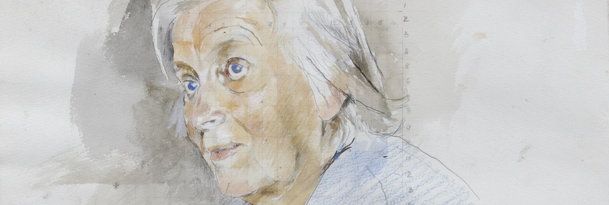
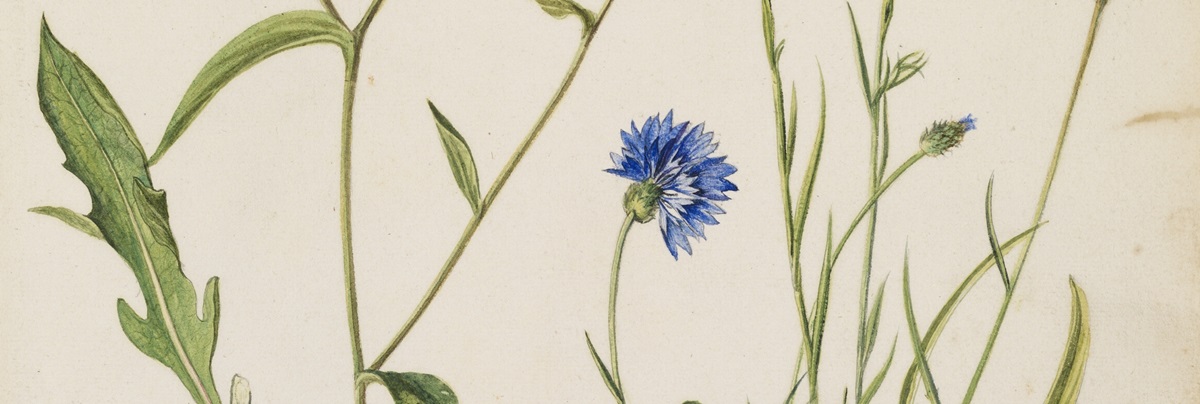
The paintings of Richard Waller FRS (c. 1660-1715) are technically brilliant and years ahead of their time. His groundbreaking set of botanical watercolours was intended to illustrate a catalogue of plants.
Sir William Hamilton FRS (1731-1803) arrived in Naples in 1764, intent on a systematic study of modern volcanic eruptions. He employed a monk, Antonio Piaggi, to keep daily written observations and pencil sketches of activity at Vesuvius.
<!-- rolodex -->
<section id="exampleRolodex" class="rolodex doubleBottomGap">
<div class="rolodexSelect styledSelect" hidden="hidden">
<select>
<option>The Davy lamp</option>
<option>A Nobel laureate</option>
<option selected="selected">Hooke’s micrographia</option>
<option>Principia mathematica</option>
<option>The art and science of Richard Waller</option>
<option>A view of Vesuvius</option>
</select>
</div>
<div class="rolodexControls cf">
<a class="prev left icon iconNavigateUp" href="#"><span class="offScreen">Up</span></a>
<ul class="controlsContainer">
<li><a href="#">The Davy lamp</a></li>
<li><a href="#">A Nobel laureate</a></li>
<li class="current"><a href="#">Hooke’s micrographia</a></li>
<li><a href="#">Principia mathematica</a></li>
<li><a href="#">The art and science of Richard Waller</a></li>
<li><a href="#">A view of Vesuvius</a></li>
</ul>
<a class="next left icon iconNavigateDown" href="#"><span class="offScreen">Down</span></a>
</div>
<ul class="rolodexContent">
<li>
<div class="lazyLoad noRatio">
<noscript data-src="img/placeholder/rolodex.jpg" data-alt="Davy's Safety Lamp"><img src="img/placeholder/rolodex.jpg" alt="Davy's Safety Lamp" /></noscript>
</div>
<div class="imageOverlay rolodexOverlay">
<h3>The Davy lamp</h3>
<p>Sir Humphry Davy (1778-1829) was a chemist, but perhaps is best known for inventing the miners’ safety-lamp, a lamp that would not cause explosions when gas was present in mines. </p>
<a class="btn btnBordered fullWidth" href="/collections/davy-lamp">Read more</a>
</div>
</li>
<li>
<div class="lazyLoad noRatio">
<noscript data-src="img/placeholder/rolodex1.jpg" data-alt="Dorothy Hodgkin"><img src="img/placeholder/rolodex1.jpg" alt="Dorothy Hodgkin" /></noscript>
</div>
<div class="imageOverlay rolodexOverlay">
<h3>A Nobel laureate</h3>
<p>Dorothy Crowfoot Hodgkin OM FRS (1910-1994) was a leading biochemist and a pioneer in the field of protein crystallography. She received a Nobel Prize in Chemistry in 1964, the first British woman to be so honoured.</p>
<a class="btn btnBordered fullWidth" href="/collections/dorothy-hodgkin">Read more</a>
</div>
</li>
<li class="current">
<div class="lazyLoad noRatio">
<noscript data-src="img/placeholder/rolodex2.jpg" data-alt="Illustration of a flea"><img src="img/placeholder/rolodex2.jpg" alt="Illustration of a flea" /></noscript>
</div>
<div class="imageOverlay rolodexOverlay">
<h3>Hooke’s micrographia</h3>
<p>This is the world’s first illustrated book of microscopic observations. Robert Hooke investigated many everyday objects through the microscope, including a feather, mould, a razor’s edge, finely woven cloth, and even a full stop printed in a book.</p>
<a class="btn btnBordered fullWidth" href="/collections/micrographia">Read more</a>
</div>
</li>
<li>
<div class="lazyLoad noRatio">
<noscript data-src="img/placeholder/rolodex.jpg" data-alt="Principia Mathematica"><img src="img/placeholder/rolodex.jpg" alt="Principia Mathematica" /></noscript>
</div>
<div class="imageOverlay rolodexOverlay">
<h3>Principia mathematica</h3>
<p>The manuscript of Sir Isaac Newton’s work, <em>philosophiae naturalis principia mathematica </em>(1687, mathematical principles of natural philosophy), is the Royal Society’s greatest treasure and a cornerstone of scientific thought.</p>
<a class="btn btnBordered fullWidth" href="/collections/principia-mathematica">Read more</a>
</div>
</li>
<li>
<div class="lazyLoad noRatio">
<noscript data-src="img/placeholder/rolodex1.jpg" data-alt="Richard Waller"><img src="img/placeholder/rolodex1.jpg" alt="Richard Waller" /></noscript>
</div>
<div class="imageOverlay rolodexOverlay">
<h3>The art and science of Richard Waller</h3>
<p>The paintings of Richard Waller FRS (c. 1660-1715) are technically brilliant and years ahead of their time. His groundbreaking set of botanical watercolours was intended to illustrate a catalogue of plants. </p>
<a class="btn btnBordered fullWidth" href="/collections/richard-waller">Read more</a>
</div>
</li>
<li>
<div class="lazyLoad noRatio">
<noscript data-src="img/placeholder/rolodex2.jpg" data-alt="Mt Vesuvius"><img src="img/placeholder/rolodex2.jpg" alt="Mt Vesuvius" /></noscript>
</div>
<div class="imageOverlay rolodexOverlay">
<h3>A view of Vesuvius</h3>
<p>Sir William Hamilton FRS (1731-1803) arrived in Naples in 1764, intent on a systematic study of modern volcanic eruptions. He employed a monk, Antonio Piaggi, to keep daily written observations and pencil sketches of activity at Vesuvius. </p>
<a class="btn btnBordered fullWidth" href="/collections/vesivius">Read more</a>
</div>
</li>
</ul>
</section>
Required CSS
css/main.css - incudes the main CSS styles for the Rolodex.
css/modular.css - includes any modular, reusable CSS rules like .left and .doubleBottomGap which are used for the Rolodex.
css/print.css - includes any print specific CSS styles that are used for the Rolodex.
css/responsive.css - includes responsive CSS styles for the Rolodex.
Required JavaScript
jquery.min.js - jQuery version 1.11.1 referenced externally.
js/main.js - contains the main site JS.
js/rolodex.js - contains JS for the Rolodex functionality.
js/imageSizes.js - contains JS for lazy loading images. Uses container size and pixel ratio to establish which size image to display and then lazy load it.
js/interact.1.0.0.js - dependency required for page.js and main.js.
js/core.1.0.1.js - dependency required for page.js and main.js.
js/respond.min.js - min/max-width media query polyfill for older versions of IE.
Significant responsive state changes
The significant change for the Rolodex happens at 760px when the Rolodex changes into a simple select input with content that changes when different options are selected. The Rolodex then stays the same all the way down to lowest viewport (320px). Please see screenshots of before and after below.
The People card is used to display information about Fellows within search listings like the Fellow search. They include an image, name and elected year on the front and name, membership type, elected year and scientific areas on the back.
css/main.css - includes the main CSS styles for the People card.
css/responsive.css - includes the responsive CSS styles for the People card.
css/modular.css - includes any reusable CSS rules like .noMargin, .bottomGap, .left which are used for the People card.
css/print.css - includes any print specific CSS styles that are used for the People card.
Required JavaScript
jquery.min.js - jQuery version 1.11.1 referenced externally.
js/page.js - contains JS required for card flip.
js/main.js - contains the main site JS.
js/interact.1.0.0.js - dependency required for page.js and main.js.
js/core.1.0.1.js - dependency required for page.js and main.js.
js/respond.min.js - min/max-width media query polyfill for older versions of IE.
js/ie8.js - JS polyfills and fallbacks for CSS items that lack IE8 support.
Significant responsive state changes
The significant changes for the People card happen at 1080px, 950px, 690px and 500px when the maximum number of cards per row changes to make the most of the available space. Please see screenshots of before and after below.
The Event card is used to display information about upcoming and past events within the events listing. They include an image, name and caption on the front and additional description on the back.
Lorem ipsum dolor sit amet, consectetur adipiscing elit, sed do eiusmod tempor incididunt ut labore et dolore magna aliqua. Ut enim ad minim veniam, quis nostrud exercitation ullamco laboris nisi ut aliquip ex ea commodo consequat. Duis aute irure dolor in reprehenderit in voluptate velit esse cillum dolore eu fugiat nulla pariatur. Excepteur sint occaecat cupidatat non proident, sunt in culpa qui officia deserunt mollit anim id est laborum.
Lorem ipsum dolor sit amet, consectetur adipiscing elit, sed do eiusmod tempor incididunt ut labore et dolore magna aliqua. Ut enim ad minim veniam, quis nostrud exercitation ullamco laboris nisi ut aliquip ex ea commodo consequat. Duis aute irure dolor in reprehenderit in voluptate velit esse cillum dolore eu fugiat nulla pariatur. Excepteur sint occaecat cupidatat non proident, sunt in culpa qui officia deserunt mollit anim id est laborum.
Lorem ipsum dolor sit amet, consectetur adipiscing elit, sed do eiusmod tempor incididunt ut labore et dolore magna aliqua. Ut enim ad minim veniam, quis nostrud exercitation ullamco laboris nisi ut aliquip ex ea commodo consequat. Duis aute irure dolor in reprehenderit in voluptate velit esse cillum dolore eu fugiat nulla pariatur. Excepteur sint occaecat cupidatat non proident, sunt in culpa qui officia deserunt mollit anim id est laborum.
Lorem ipsum dolor sit amet, consectetur adipiscing elit, sed do eiusmod tempor incididunt ut labore et dolore magna aliqua. Ut enim ad minim veniam, quis nostrud exercitation ullamco laboris nisi ut aliquip ex ea commodo consequat. Duis aute irure dolor in reprehenderit in voluptate velit esse cillum dolore eu fugiat nulla pariatur. Excepteur sint occaecat cupidatat non proident, sunt in culpa qui officia deserunt mollit anim id est laborum.
							<div class="colList fourCol flipWrap clear cf">
								<div class="fourFifthCard flipContainer col" rw-set-card-height="0.8">
									<ul class="flip">
										<li class="front">
											<a class="toggleFlip icon iconFlip" href="#" title="Flip" rw-toggle-flip></a>
											<a href="#">
												<div class="flipContent">
													<p class="noMargin"><strong>The monster at the heart of our galaxy</strong></p>
												</div>
												<div class="imageContainer">
													<span class="overlayCaption overlayCaptionTop">Prize lecture</span>
													<div class="lazyLoad fourFifthRatio">
														<noscript data-src="img/placeholder/event.jpg" data-alt="The monster at the heart of our galaxy">
															<img src="img/placeholder/event.jpg" alt="The monster at the heart of our galaxy" />
														</noscript>
													</div>
												</div>
												<p class="flipHighlight indentedHighlight">01 March 2016</p>
											</a>
										</li>
										<li class="back">
											<a class="toggleFlip icon iconFlip" href="#" title="Flip" rw-toggle-flip></a>
											<div class="flipContent">
												<p><strong>The monster at the heart of our galaxy</strong></p>
												<p><strong>01 March 2016</strong></p>
												<p><strong>6-9 Carlton House Terrace, London, SW1Y 5AG</strong></p>
												<ul class="contentList squareList">
													<li>Series: <strong>Prize lecture</strong></li>
												</ul>
												<div>
													<p>Lorem ipsum dolor sit amet, consectetur adipiscing elit, sed do eiusmod tempor incididunt ut labore et dolore magna aliqua. Ut enim ad minim veniam, quis nostrud exercitation ullamco laboris nisi ut aliquip ex ea commodo consequat. Duis aute irure dolor in reprehenderit in voluptate velit esse cillum dolore eu fugiat nulla pariatur. Excepteur sint occaecat cupidatat non proident, sunt in culpa qui officia deserunt mollit anim id est laborum.</p>
												</div>
											</div>
										</li>
									</ul>
								</div>
							</div>
Required CSS
css/main.css - includes the main CSS styles for the Event card.
css/responsive.css - includes the responsive CSS styles for the Event card.
css/modular.css - includes any reusable CSS rules like .noMargin, .bottomGap, .left which are used for the Event card.
css/print.css - includes any print specific CSS styles that are used for the Event card.
Required JavaScript
jquery.min.js - jQuery version 1.11.1 referenced externally.
js/page.js - contains JS required for card flip.
js/main.js - contains the main site JS.
js/interact.1.0.0.js - dependency required for page.js and main.js.
js/core.1.0.1.js - dependency required for page.js and main.js.
js/respond.min.js - min/max-width media query polyfill for older versions of IE.
js/ie8.js - JS polyfills and fallbacks for CSS items that lack IE8 support.
Significant responsive state changes
The significant changes for the Event card happen at 950px and 520px when the maximum number of cards per row changes to make the most of the available space. The Event card then stay the same all the way down to lowest viewport (320px). Please see screenshots of before and after below.
The Grant/Award card is used to display information about Grants and Awards within the the Grants and Awards listings. They include an image, title and link on the front and title and description on the back.
A scheme for outstanding scientists in the UK at an early stage of their research career who require a flexible working pattern due to personal circumstances such as parenting or caring responsibilities or health issues.
A scheme for outstanding scientists in the UK at an early stage of their research career who require a flexible working pattern due to personal circumstances such as parenting or caring responsibilities or health issues.
A scheme for outstanding scientists in the UK at an early stage of their research career who require a flexible working pattern due to personal circumstances such as parenting or caring responsibilities or health issues.
A scheme for outstanding scientists in the UK at an early stage of their research career who require a flexible working pattern due to personal circumstances such as parenting or caring responsibilities or health issues.
							<section class="contentBox bottomGap cf">
								<div class="cf">
									<div class="colList fourCol flipWrap clear cf">
										<div class="fourFifthCard flipContainer col" rw-set-card-height="0.8">
											<ul class="flip">
												<li class="front">
													<a class="toggleFlip darkFlip icon iconFlip" href="#" title="Flip" rw-toggle-flip></a>
													<a href="#">
														<div class="flipContent lightGrey darkText">
															<p><strong>Dorothy Hodgkin Fellowship</strong></p>
														</div>
														<div class="imageContainer">
															<div class="lazyLoad fourFifthRatio">
																<noscript data-src="img/placeholder/grant.jpg" data-alt="Dorothy Hodgkin Fellowship">
																	<img src="img/placeholder/grant.jpg" alt="Dorothy Hodgkin Fellowship" />
																</noscript>
															</div>
														</div>
													</a>
												</li>
												<li class="back">
													<a class="toggleFlip icon iconFlip" href="#" title="Flip" rw-toggle-flip></a>
													<div class="flipContent">
														<p><strong>Dorothy Hodgkin Fellowship</strong></p>
														<div>
															<p>A scheme for outstanding scientists in the UK at an early stage of their research career who require a flexible working pattern due to personal circumstances such as parenting or caring responsibilities or health issues.</p>
															<p><strong>Closing date: 12 January 2016</strong></p>
														</div>
													</div>
												</li>
											</ul>
										</div>
									</div>
								</div>
							</section>
Required CSS
css/main.css - includes the main CSS styles for the Grant/Award card.
css/responsive.css - includes the responsive CSS styles for the Grant/Award card.
css/modular.css - includes any reusable CSS rules like .noMargin, .bottomGap, .left which are used for the Grant/Award card.
css/print.css - includes any print specific CSS styles that are used for the Grant/Award card.
Required JavaScript
jquery.min.js - jQuery version 1.11.1 referenced externally.
js/page.js - contains JS required for card flip.
js/main.js - contains the main site JS.
js/interact.1.0.0.js - dependency required for page.js and main.js.
js/core.1.0.1.js - dependency required for page.js and main.js.
js/respond.min.js - min/max-width media query polyfill for older versions of IE.
js/ie8.js - JS polyfills and fallbacks for CSS items that lack IE8 support.
Significant responsive state changes
The significant changes for the Grant/Award card happen at 950px and 520px when the maximum number of cards per row changes to make the most of the available space. The Grant/Award card then stays the same all the way down to lowest viewport (320px). Please see screenshots of before and after below.
css/main.css - includes the main CSS styles for the Blog post card.
css/responsive.css - includes the responsive CSS styles for the Blog post card.
css/modular.css - includes any reusable CSS rules like .noMargin which are used for the Blog post card.
css/print.css - includes any print specific CSS styles that are used for the Blog post card.
Required JavaScript
jquery.min.js - jQuery version 1.11.1 referenced externally.
js/page.js - contains additional site JS.
js/main.js - contains the main site JS.
js/interact.1.0.0.js - dependency required for page.js and main.js.
js/core.1.0.1.js - dependency required for page.js and main.js.
js/respond.min.js - min/max-width media query polyfill for older versions of IE.
js/ie8.js - JS polyfills and fallbacks for CSS items that lack IE8 support.
Significant responsive state changes
The significant changes for the Blog post card happen at 950px and 520px when the maximum number of cards per row changes to make the most of the available space. The Blog post card then stays the same all the way down to lowest viewport (320px). Please see screenshots of before and after below.
							<div class="colList twoCol cf">
								<section class="col splitCol noMargin">
									<h2>Objectivity videos</h2>
									<div class="colList twoCol cf">
										<article class="col">
											<a href="https://www.youtube.com/watch?v=Y175lZlYmYU&feature=youtu.be" target="_blank">
												<div class="imageContainer icon iconPlay">
													<div class="lazyLoad twoThirdRatio">
														<noscript data-src="img/placeholder/podcasts.jpg" data-alt="Hertha Ayrton and the road to female fellowship at The Royal Society.">
															<img src="img/placeholder/podcasts.jpg" alt="Hertha Ayrton and the road to female fellowship at The Royal Society." />
														</noscript>
													</div>
													<span class="overlayCaption overlayCaptionBottom">Hertha Ayrton and the road to female fellowship at The Royal Society.</span>
												</div>
											</a>
											<strong class="podTitle"><a href="https://www.youtube.com/watch?v=Y175lZlYmYU&feature=youtu.be" target="_blank">The Fight for Fellowship - Objectivity #56</a></strong>
											<p class="blogDate smallText">10 February 2016</p>
											<p class="smallText noMargin"><a href="https://www.youtube.com/channel/UCtwKon9qMt5YLVgQt1tvJKg/videos">Brady Haran</a></p>
										</article>
										<article class="col">
											<a href="https://www.youtube.com/watch?v=9fcWWBksfng&feature=youtu.be" target="_blank">
												<div class="imageContainer icon iconPlay">
													<div class="lazyLoad twoThirdRatio">
														<noscript data-src="img/placeholder/podcasts.jpg" data-alt="A look at the Society's historical clocks, including Captain Cook's">
															<img src="img/placeholder/podcasts.jpg" alt="A look at the Society's historical clocks, including Captain Cook's" />
														</noscript>
													</div>
													<span class="overlayCaption overlayCaptionBottom">A look at the Society's historical clocks, including Captain Cook's</span>
												</div>
											</a>
											<strong class="podTitle"><a href="https://www.youtube.com/watch?v=9fcWWBksfng&feature=youtu.be" target="_blank">Winding the Clocks - Objectivity #57</a></strong>
											<p class="blogDate smallText">16 February 2016</p>
											<p class="smallText noMargin"><a href="https://www.youtube.com/channel/UCtwKon9qMt5YLVgQt1tvJKg">Brady Haran</a></p>
										</article>
									</div>
								</section>
							</div>
Required CSS
css/main.css - includes the main CSS styles for the Video podcast card.
css/responsive.css - includes the responsive CSS styles for the Video podcast card.
css/modular.css - includes any reusable CSS rules like .noMargin which are used for the Video podcast card.
css/print.css - includes any print specific CSS styles that are used for the Video podcast card.
Required JavaScript
jquery.min.js - jQuery version 1.11.1 referenced externally.
js/page.js - contains additional site JS.
js/main.js - contains the main site JS.
js/interact.1.0.0.js - dependency required for page.js and main.js.
js/core.1.0.1.js - dependency required for page.js and main.js.
js/respond.min.js - min/max-width media query polyfill for older versions of IE.
js/ie8.js - JS polyfills and fallbacks for CSS items that lack IE8 support.
Significant responsive state changes
The significant changes for the Video podcast card happen at 950px and 520px when the maximum number of cards per row changes to make the most of the available space. The Video podcast card then stays the same all the way down to lowest viewport (320px). Please see screenshots of before and after below.
The Project card is used on projects page to show both current and past projects. It consists of a title, description, image and link through to the project detail page.
							<!-- Projects -->
							<div class="col">
								<a href="#" class="projectLink">
									<p class="projectTitle">Machine Learning</p>
									<div class="projectDetails cf">
										<div class="projectText left"><p>The project on machine learning aims to stimulate a debate, to increase awareness and demonstrate the potential of machine learning and highlight the opportunities and challenges it presents.</p></div>
										<div class="projectImage right">
											<div class="lazyLoad threeQuarterRatio">
												<noscript data-src="img/placeholder/projects.jpg" data-alt="Machine Learning<">
													<img src="img/placeholder/projects.jpg" alt="Machine Learning<" />
												</noscript>
											</div>
										</div>
									</div>
								</a>
							</div>
Required CSS
css/main.css - includes the main CSS styles for the Project card.
css/responsive.css - includes the responsive CSS styles for the Project card.
css/modular.css - includes any reusable CSS rules like .noMargin, .bottomGap, .left which are used for the Project card.
css/print.css - includes any print specific CSS styles that are used for the Project card.
Required JavaScript
jquery.min.js - jQuery version 1.11.1 referenced externally.
js/main.js - contains the main site JS.
js/imageSizes.js - contains JS for lazy loading images. Uses container size and pixel ratio to establish which size image to display and then lazy load it.
js/interact.1.0.0.js - dependency required for page.js and main.js.
js/core.1.0.1.js - dependency required for page.js and main.js.
js/respond.min.js - min/max-width media query polyfill for older versions of IE.
Significant responsive state changes
The significant changes for the Project card happen at 950px and 520px when the maximum number of cards per row changes to make the most of the available space. The Project card then stays the same all the way down to lowest viewport (320px). Please see screenshots of before and after below.
The Journal card is used on the journals page to display current journals. The front consists of a title, sub-title and link and on the reverse there is a description. The Journal card also has several different colour themes which are dark grey, green, blue, purple, light grey and red. Red is the default option and the other options are applied by adding the relevant class (see example).
							<!-- Example -->
							<div class="colList fourCol flipWrap cf">
								<div class="journalCard flipContainer fourFifthCard col">
									<ul class="flip">
										<li class="front">
											<a class="toggleFlip icon iconFlip" href="#" title="Flip"></a>
											<a href="http://rsos.royalsocietypublishing.org/">
												<article class="flipContent darkGrey">
													<p class="noMargin"><strong>Royal Society Open Science</strong></p>
												</article>
												<div class="imageContainer">
													<div class="overlayCaption overlayCaptionTop">
														<p>All science: Open access research</p>
													</div>
													<div class="lazyLoad fourFifthRatio">
														<noscript data-src="img/placeholder/journals.jpg" data-alt="Royal Society Open Science">
															<img src="img/placeholder/journals.jpg" alt="Royal Society Open Science" />
														</noscript>
													</div>
													<span class="flipLink icon iconExternalLink"></span>
												</div>
											</a>
										</li>
										<li class="back">
											<a class="toggleFlip icon iconFlip" href="#" title="Flip"></a>
											<article class="flipContent">
												<p><strong>Royal Society Open Science</strong></p>
												<p>A fast, open journal publishing high quality research across all of science, engineering and mathematics</p>
												<p>
													<span><strong>Editor-in-chief:</strong> Professor Jeremy Sanders CBE FRS</span>
													<span><strong>Access status:</strong> Fully open access</span>
												</p>
											</article>
										</li>
									</ul>
								</div>
								<div class="journalCard flipContainer fourFifthCard col">
									<ul class="flip">
										<li class="front">
											<a class="toggleFlip icon iconFlip" href="#" title="Flip"></a>
											<a href="http://rsos.royalsocietypublishing.org/">
												<article class="flipContent green">
													<p class="noMargin"><strong>Royal Society Open Science</strong></p>
												</article>
												<div class="imageContainer">
													<div class="overlayCaption overlayCaptionTop">
														<p>All science: Open access research</p>
													</div>
													<div class="lazyLoad fourFifthRatio">
														<noscript data-src="img/placeholder/journals.jpg" data-alt="Royal Society Open Science">
															<img src="img/placeholder/journals.jpg" alt="Royal Society Open Science" />
														</noscript>
													</div>
													<span class="flipLink icon iconExternalLink"></span>
												</div>
											</a>
										</li>
										<li class="back">
											<a class="toggleFlip icon iconFlip" href="#" title="Flip"></a>
											<article class="flipContent">
												<p><strong>Royal Society Open Science</strong></p>
												<p>A fast, open journal publishing high quality research across all of science, engineering and mathematics</p>
												<p>
													<span><strong>Editor-in-chief:</strong> Professor Jeremy Sanders CBE FRS</span>
													<span><strong>Access status:</strong> Fully open access</span>
												</p>
											</article>
										</li>
									</ul>
								</div>
								<div class="journalCard flipContainer fourFifthCard col">
									<ul class="flip">
										<li class="front">
											<a class="toggleFlip icon iconFlip" href="#" title="Flip"></a>
											<a href="http://rsos.royalsocietypublishing.org/">
												<article class="flipContent blue">
													<p class="noMargin"><strong>Royal Society Open Science</strong></p>
												</article>
												<div class="imageContainer">
													<div class="overlayCaption overlayCaptionTop">
														<p>All science: Open access research</p>
													</div>
													<div class="lazyLoad fourFifthRatio">
														<noscript data-src="img/placeholder/journals.jpg" data-alt="Royal Society Open Science">
															<img src="img/placeholder/journals.jpg" alt="Royal Society Open Science" />
														</noscript>
													</div>
													<span class="flipLink icon iconExternalLink"></span>
												</div>
											</a>
										</li>
										<li class="back">
											<a class="toggleFlip icon iconFlip" href="#" title="Flip"></a>
											<article class="flipContent">
												<p><strong>Royal Society Open Science</strong></p>
												<p>A fast, open journal publishing high quality research across all of science, engineering and mathematics</p>
												<p>
													<span><strong>Editor-in-chief:</strong> Professor Jeremy Sanders CBE FRS</span>
													<span><strong>Access status:</strong> Fully open access</span>
												</p>
											</article>
										</li>
									</ul>
								</div>
								<div class="journalCard flipContainer fourFifthCard col">
									<ul class="flip">
										<li class="front">
											<a class="toggleFlip icon iconFlip" href="#" title="Flip"></a>
											<a href="http://rsos.royalsocietypublishing.org/">
												<article class="flipContent purple">
													<p class="noMargin"><strong>Royal Society Open Science</strong></p>
												</article>
												<div class="imageContainer">
													<div class="overlayCaption overlayCaptionTop">
														<p>All science: Open access research</p>
													</div>
													<div class="lazyLoad fourFifthRatio">
														<noscript data-src="img/placeholder/journals.jpg" data-alt="Royal Society Open Science">
															<img src="img/placeholder/journals.jpg" alt="Royal Society Open Science" />
														</noscript>
													</div>
													<span class="flipLink icon iconExternalLink"></span>
												</div>
											</a>
										</li>
										<li class="back">
											<a class="toggleFlip icon iconFlip" href="#" title="Flip"></a>
											<article class="flipContent">
												<p><strong>Royal Society Open Science</strong></p>
												<p>A fast, open journal publishing high quality research across all of science, engineering and mathematics</p>
												<p>
													<span><strong>Editor-in-chief:</strong> Professor Jeremy Sanders CBE FRS</span>
													<span><strong>Access status:</strong> Fully open access</span>
												</p>
											</article>
										</li>
									</ul>
								</div>
								<div class="journalCard flipContainer fourFifthCard col">
									<ul class="flip">
										<li class="front">
											<a class="toggleFlip icon iconFlip" href="#" title="Flip"></a>
											<a href="http://rsos.royalsocietypublishing.org/">
												<article class="flipContent lightGrey">
													<p class="noMargin"><strong>Royal Society Open Science</strong></p>
												</article>
												<div class="imageContainer">
													<div class="overlayCaption overlayCaptionTop">
														<p>All science: Open access research</p>
													</div>
													<div class="lazyLoad fourFifthRatio">
														<noscript data-src="img/placeholder/journals.jpg" data-alt="Royal Society Open Science">
															<img src="img/placeholder/journals.jpg" alt="Royal Society Open Science" />
														</noscript>
													</div>
													<span class="flipLink icon iconExternalLink"></span>
												</div>
											</a>
										</li>
										<li class="back">
											<a class="toggleFlip icon iconFlip" href="#" title="Flip"></a>
											<article class="flipContent">
												<p><strong>Royal Society Open Science</strong></p>
												<p>A fast, open journal publishing high quality research across all of science, engineering and mathematics</p>
												<p>
													<span><strong>Editor-in-chief:</strong> Professor Jeremy Sanders CBE FRS</span>
													<span><strong>Access status:</strong> Fully open access</span>
												</p>
											</article>
										</li>
									</ul>
								</div>
								<div class="journalCard flipContainer fourFifthCard col">
									<ul class="flip">
										<li class="front">
											<a class="toggleFlip icon iconFlip" href="#" title="Flip"></a>
											<a href="http://rsos.royalsocietypublishing.org/">
												<article class="flipContent darkGrey">
													<p class="noMargin"><strong>Royal Society Open Science</strong></p>
												</article>
												<div class="imageContainer">
													<div class="overlayCaption overlayCaptionTop">
														<p>All science: Open access research</p>
													</div>
													<div class="lazyLoad fourFifthRatio">
														<noscript data-src="img/placeholder/journals.jpg" data-alt="Royal Society Open Science">
															<img src="img/placeholder/journals.jpg" alt="Royal Society Open Science" />
														</noscript>
													</div>
													<span class="flipLink icon iconExternalLink"></span>
												</div>
											</a>
										</li>
										<li class="back">
											<a class="toggleFlip icon iconFlip" href="#" title="Flip"></a>
											<article class="flipContent">
												<p><strong>Royal Society Open Science</strong></p>
												<p>A fast, open journal publishing high quality research across all of science, engineering and mathematics</p>
												<p>
													<span><strong>Editor-in-chief:</strong> Professor Jeremy Sanders CBE FRS</span>
													<span><strong>Access status:</strong> Fully open access</span>
												</p>
											</article>
										</li>
									</ul>
								</div>
								<div class="journalCard flipContainer fourFifthCard col">
									<ul class="flip">
										<li class="front">
											<a class="toggleFlip icon iconFlip" href="#" title="Flip"></a>
											<a href="http://rsos.royalsocietypublishing.org/">
												<article class="flipContent green">
													<p class="noMargin"><strong>Royal Society Open Science</strong></p>
												</article>
												<div class="imageContainer">
													<div class="overlayCaption overlayCaptionTop">
														<p>All science: Open access research</p>
													</div>
													<div class="lazyLoad fourFifthRatio">
														<noscript data-src="img/placeholder/journals.jpg" data-alt="Royal Society Open Science">
															<img src="img/placeholder/journals.jpg" alt="Royal Society Open Science" />
														</noscript>
													</div>
													<span class="flipLink icon iconExternalLink"></span>
												</div>
											</a>
										</li>
										<li class="back">
											<a class="toggleFlip icon iconFlip" href="#" title="Flip"></a>
											<article class="flipContent">
												<p><strong>Royal Society Open Science</strong></p>
												<p>A fast, open journal publishing high quality research across all of science, engineering and mathematics</p>
												<p>
													<span><strong>Editor-in-chief:</strong> Professor Jeremy Sanders CBE FRS</span>
													<span><strong>Access status:</strong> Fully open access</span>
												</p>
											</article>
										</li>
									</ul>
								</div>
								<div class="journalCard flipContainer fourFifthCard col">
									<ul class="flip">
										<li class="front">
											<a class="toggleFlip icon iconFlip" href="#" title="Flip"></a>
											<a href="http://rsos.royalsocietypublishing.org/">
												<article class="flipContent blue">
													<p class="noMargin"><strong>Royal Society Open Science</strong></p>
												</article>
												<div class="imageContainer">
													<div class="overlayCaption overlayCaptionTop">
														<p>All science: Open access research</p>
													</div>
													<div class="lazyLoad fourFifthRatio">
														<noscript data-src="img/placeholder/journals.jpg" data-alt="Royal Society Open Science">
															<img src="img/placeholder/journals.jpg" alt="Royal Society Open Science" />
														</noscript>
													</div>
													<span class="flipLink icon iconExternalLink"></span>
												</div>
											</a>
										</li>
										<li class="back">
											<a class="toggleFlip icon iconFlip" href="#" title="Flip"></a>
											<article class="flipContent">
												<p><strong>Royal Society Open Science</strong></p>
												<p>A fast, open journal publishing high quality research across all of science, engineering and mathematics</p>
												<p>
													<span><strong>Editor-in-chief:</strong> Professor Jeremy Sanders CBE FRS</span>
													<span><strong>Access status:</strong> Fully open access</span>
												</p>
											</article>
										</li>
									</ul>
								</div>
							</div>
Required CSS
css/main.css - includes the main CSS styles for the Journal card.
css/responsive.css - includes the responsive CSS styles for the Journal card.
css/print.css - includes any print specific CSS styles that are used for the Journal card.
Required JavaScript
jquery.min.js - jQuery version 1.11.1 referenced externally.
js/main.js - contains the main site JS.
js/page.js - contains the additional site JS.
js/imageSizes.js - contains JS for lazy loading images. Uses container size and pixel ratio to establish which size image to display and then lazy load it.
js/interact.1.0.0.js - dependency required for page.js and main.js.
js/core.1.0.1.js - dependency required for page.js and main.js.
js/respond.min.js - min/max-width media query polyfill for older versions of IE.
Significant responsive state changes
The significant changes for the Journal card happen at 950px and 520px when the maximum number of cards per row changes to make the most of the available space. The Journal card then stays the same all the way down to lowest viewport (320px). Please see screenshots of before and after below.
The Committee card is used to show relevant information about a Committee. They consist of a title, link and image on the front and a title on the back.
						<!-- Committees -->
						<section class="contentBox bottomGap cf">
							<section class="twoThirdWidth left">
								<div class="colList fourColRestricted flipWrap cf">
									<!-- Committees -->
									<div class="colList fourColRestricted flipWrap cf">
										<article class="committeeCard fourFifthCard flipContainer col">
											<ul class="flip">
												<li class="front">
													<a class="toggleFlip icon iconFlip" href="#" title="Flip"></a>
													<a href="#">
														<article class="flipContent">
															<p><strong>UK Research and the European Union Working Group</strong></p>
														</article>
														<div class="lazyLoad fourFifthRatio">
															<noscript data-src="img/placeholder/committee.jpg" data-alt="UK and EU funding">
																<img src="img/placeholder/committee.jpg" alt="UK and EU funding" />
															</noscript>
														</div>
													</a>
												</li>
												<li class="back">
													<a class="toggleFlip icon iconFlip" href="#" title="Flip"></a>
													<article class="flipContent">
														<p><strong>UK Research and the European Union Working Group</strong></p>
														<div class="rteContent"></div>
													</article>
												</li>
											</ul>
										</article>
									</div>
								</div>
								<h3 class="accordion ">Standing Committee</h3>
								<div class="accordionContent">
									<div class="colList fourColRestricted flipWrap cf">
										<article class="committeeCard fourFifthCard flipContainer col">
											<ul class="flip">
												<li class="front">
													<a class="toggleFlip icon iconFlip" href="#" title="Flip"></a>
													<a href="#">
														<article class="flipContent">
															<p><strong>UK Research and the European Union Working Group</strong></p>
														</article>
														<div class="lazyLoad fourFifthRatio">
															<noscript data-src="img/placeholder/committee.jpg" data-alt="UK and EU funding">
																<img src="img/placeholder/committee.jpg" alt="UK and EU funding" />
															</noscript>
														</div>
													</a>
												</li>
												<li class="back">
													<a class="toggleFlip icon iconFlip" href="#" title="Flip"></a>
													<article class="flipContent">
														<p><strong>UK Research and the European Union Working Group</strong></p>
														<div class="rteContent"></div>
													</article>
												</li>
											</ul>
										</article>
										<article class="committeeCard fourFifthCard flipContainer col">
											<ul class="flip">
												<li class="front">
													<a class="toggleFlip icon iconFlip" href="#" title="Flip"></a>
													<a href="#">
														<article class="flipContent">
															<p><strong>UK Research and the European Union Working Group</strong></p>
														</article>
														<div class="lazyLoad fourFifthRatio">
															<noscript data-src="img/placeholder/committee.jpg" data-alt="UK and EU funding">
																<img src="img/placeholder/committee.jpg" alt="UK and EU funding" />
															</noscript>
														</div>
													</a>
												</li>
												<li class="back">
													<a class="toggleFlip icon iconFlip" href="#" title="Flip"></a>
													<article class="flipContent">
														<p><strong>UK Research and the European Union Working Group</strong></p>
														<div class="rteContent"></div>
													</article>
												</li>
											</ul>
										</article>
									</div>
								</div>
								<h3 class="accordion ">Working Group</h3>
								<div class="accordionContent">
									<div class="colList fourColRestricted flipWrap cf">
										<article class="committeeCard fourFifthCard flipContainer col">
											<ul class="flip">
												<li class="front">
													<a class="toggleFlip icon iconFlip" href="#" title="Flip"></a>
													<a href="#">
														<article class="flipContent">
															<p><strong>UK Research and the European Union Working Group</strong></p>
														</article>
														<div class="lazyLoad fourFifthRatio">
															<noscript data-src="img/placeholder/committee.jpg" data-alt="UK and EU funding">
																<img src="img/placeholder/committee.jpg" alt="UK and EU funding" />
															</noscript>
														</div>
													</a>
												</li>
												<li class="back">
													<a class="toggleFlip icon iconFlip" href="#" title="Flip"></a>
													<article class="flipContent">
														<p><strong>UK Research and the European Union Working Group</strong></p>
														<div class="rteContent"></div>
													</article>
												</li>
											</ul>
										</article>
										<article class="committeeCard fourFifthCard flipContainer col">
											<ul class="flip">
												<li class="front">
													<a class="toggleFlip icon iconFlip" href="#" title="Flip"></a>
													<a href="#">
														<article class="flipContent">
															<p><strong>UK Research and the European Union Working Group</strong></p>
														</article>
														<div class="lazyLoad fourFifthRatio">
															<noscript data-src="img/placeholder/committee.jpg" data-alt="UK and EU funding">
																<img src="img/placeholder/committee.jpg" alt="UK and EU funding" />
															</noscript>
														</div>
													</a>
												</li>
												<li class="back">
													<a class="toggleFlip icon iconFlip" href="#" title="Flip"></a>
													<article class="flipContent">
														<p><strong>UK Research and the European Union Working Group</strong></p>
														<div class="rteContent"></div>
													</article>
												</li>
											</ul>
										</article>
										<article class="committeeCard fourFifthCard flipContainer col">
											<ul class="flip">
												<li class="front">
													<a class="toggleFlip icon iconFlip" href="#" title="Flip"></a>
													<a href="#">
														<article class="flipContent">
															<p><strong>UK Research and the European Union Working Group</strong></p>
														</article>
														<div class="lazyLoad fourFifthRatio">
															<noscript data-src="img/placeholder/committee.jpg" data-alt="UK and EU funding">
																<img src="img/placeholder/committee.jpg" alt="UK and EU funding" />
															</noscript>
														</div>
													</a>
												</li>
												<li class="back">
													<a class="toggleFlip icon iconFlip" href="#" title="Flip"></a>
													<article class="flipContent">
														<p><strong>UK Research and the European Union Working Group</strong></p>
														<div class="rteContent"></div>
													</article>
												</li>
											</ul>
										</article>
									</div>
									</div>
								<section>
							</section>
Required CSS
css/main.css - incudes the main CSS styles for the Committee card.
css/modular.css - includes any modular, reusable CSS rules like .left and .halfBottomGp which are used for the Committee card.
css/print.css - includes any print specific CSS styles that are used for the Committee card.
css/responsive.css - includes responsive CSS styles for the Committee card.
Required JavaScript
jquery.min.js - jQuery version 1.11.1 referenced externally.
js/page.js - contains JS required for the Committee card.
js/main.js - contains the main site JS.
js/interact.1.0.0.js - dependency required for page.js and main.js.
js/core.1.0.1.js - dependency required for page.js and main.js.
js/respond.min.js - min/max-width media query polyfill for older versions of IE.
js/ie8.js - JS polyfills and fallbacks for CSS items that lack IE8 support
Significant responsive state changes
The significant changes for the Committee card happen at 950px and 520px when the maximum number of cards per row changes to make the most of the available space. The Committee card then stays the same all the way down to lowest viewport (320px). Please see screenshots of before and after below.
The Medallist card is used to display information about Fellows who have won awards. They include an image, name and link on the front and name, membership type, elected year and scientific areas on the back and also the medal/award they have won above the card.
css/main.css - incudes the main CSS styles for the medallist element.
css/modular.css - includes any modular, reusable CSS rules like .left and .halfBottomGp which are used for the medallist element.
css/print.css - includes any print specific CSS styles that are used for the medallist element.
css/responsive.css - includes responsive CSS styles for the medallist element.
Required JavaScript
jquery.min.js - jQuery version 1.11.1 referenced externally.
js/page.js - contains JS required for the Medallist pod.
js/main.js - contains the main site JS.
js/interact.1.0.0.js - dependency required for page.js and main.js.
js/core.1.0.1.js - dependency required for page.js and main.js.
js/respond.min.js - min/max-width media query polyfill for older versions
js/respond.min.js - min/max-width media query polyfill for older versions of IE.
js/ie8.js - JS polyfills and fallbacks for CSS items that lack IE8 support
Significant responsive state changes
The significant changes for the Medallist card happen at 950px and 520px when the maximum number of cards per row changes to make the most of the available space. The Medallist card then stays the same all the way down to lowest viewport (320px). Please see screenshots of before and after below.
css/main.css - incudes the main CSS styles for the Date/Time element.
css/modular.css - includes any modular, reusable CSS rules like .left and .halfBottomGp which are used for the Date/Time element.
css/print.css - includes any print specific CSS styles that are used for the Date/Time element.
css/responsive.css - includes responsive CSS styles for the Date/Time element.
Required JavaScript
js/respond.min.js - min/max-width media query polyfill for older versions of IE.
js/ie8.js - JS polyfills and fallbacks for CSS items that lack IE8 support
Significant responsive state changes
The significant change for the Date/Time element happens at 550px when they stack on top of each other. The Date/Time element then stays the same all the way down to lowest viewport (320px). Please see screenshots of before and after below.
The Sticky registration panel can be found on the right side of event detail pages. They use jQuery to follow the user as he scrolls down the page. This was meant to be used on the very last content section on a page as it follows the screen until the user is at the end of the page. If there are any content sections below the one with a Sticky registration panel, the Sticky registration panel will cover any content directly behind it as it follows the user down the page. For a functional example please click here.
Example
Main Content Area
Lorem ipsum dolor sit amet, consectetur adipiscing elit, sed do eiusmod tempor incididunt ut labore et dolore magna aliqua. Ut enim ad minim veniam, quis nostrud exercitation ullamco laboris nisi ut aliquip ex ea commodo consequat. Duis aute irure dolor in reprehenderit in voluptate velit esse cillum dolore eu fugiat nulla pariatur. Excepteur sint occaecat cupidatat non proident, sunt in culpa qui officia deserunt mollit anim id est laborum.
Lorem ipsum dolor sit amet, consectetur adipiscing elit, sed do eiusmod tempor incididunt ut labore et dolore magna aliqua. Ut enim ad minim veniam, quis nostrud exercitation ullamco laboris nisi ut aliquip ex ea commodo consequat. Duis aute irure dolor in reprehenderit in voluptate velit esse cillum dolore eu fugiat nulla pariatur. Excepteur sint occaecat cupidatat non proident, sunt in culpa qui officia deserunt mollit anim id est laborum.
Register for this event
Lorem ipsum dolor sit amet, consectetur adipiscing elit, sed do eiusmod tempor incididunt ut labore et dolore magna aliqua.
Lorem ipsum dolor sit amet, consectetur adipiscing elit, sed do eiusmod tempor incididunt ut labore et dolore magna aliqua. Ut enim ad minim veniam, quis nostrud exercitation ullamco laboris nisi ut aliquip ex ea commodo consequat. Duis aute irure dolor in reprehenderit in voluptate velit esse cillum dolore eu fugiat nulla pariatur. Excepteur sint occaecat cupidatat non proident, sunt in culpa qui officia deserunt mollit anim id est laborum.
Lorem ipsum dolor sit amet, consectetur adipiscing elit, sed do eiusmod tempor incididunt ut labore et dolore magna aliqua. Ut enim ad minim veniam, quis nostrud exercitation ullamco laboris nisi ut aliquip ex ea commodo consequat. Duis aute irure dolor in reprehenderit in voluptate velit esse cillum dolore eu fugiat nulla pariatur. Excepteur sint occaecat cupidatat non proident, sunt in culpa qui officia deserunt mollit anim id est laborum.
Lorem ipsum dolor sit amet, consectetur adipiscing elit, sed do eiusmod tempor incididunt ut labore et dolore magna aliqua. Ut enim ad minim veniam, quis nostrud exercitation ullamco laboris nisi ut aliquip ex ea commodo consequat. Duis aute irure dolor in reprehenderit in voluptate velit esse cillum dolore eu fugiat nulla pariatur. Excepteur sint occaecat cupidatat non proident, sunt in culpa qui officia deserunt mollit anim id est laborum.
Lorem ipsum dolor sit amet, consectetur adipiscing elit, sed do eiusmod tempor incididunt ut labore et dolore magna aliqua. Ut enim ad minim veniam, quis nostrud exercitation ullamco laboris nisi ut aliquip ex ea commodo consequat. Duis aute irure dolor in reprehenderit in voluptate velit esse cillum dolore eu fugiat nulla pariatur. Excepteur sint occaecat cupidatat non proident, sunt in culpa qui officia deserunt mollit anim id est laborum.
							<!-- Structural Markup -->
							<section class="contentBox bottomGap cf">
								<!-- Sticky registration panel -->
								<aside class="oneThirdWidth leftGutter right">
									<article id="stickyPanel" class="panel bottomGap cf stick">
										<h4 class="semi">Register for this event</h4>
										<p>Lorem ipsum dolor sit amet, consectetur adipiscing elit, sed do eiusmod tempor incididunt ut labore et dolore magna aliqua.</p>
										<p class="eventPrice left">£35</p>
										<a href="https://royalsociety.wufoo.com/forms/request-invitation-to-scientific-meeting/" class="btn btnBordered right noMargin">Request an invitation</a>
									</article>
								</aside>
								<section class="twoThirdWidth left">
									<h2>Main Content Area</h2>
									<p>Lorem ipsum dolor sit amet, consectetur adipiscing elit, sed do eiusmod tempor incididunt ut labore et dolore magna aliqua. Ut enim ad minim veniam, quis nostrud exercitation ullamco laboris nisi ut aliquip ex ea commodo consequat. Duis aute irure dolor in reprehenderit in voluptate velit esse cillum dolore eu fugiat nulla pariatur. Excepteur sint occaecat cupidatat non proident, sunt in culpa qui officia deserunt mollit anim id est laborum.</p>
									<p>Lorem ipsum dolor sit amet, consectetur adipiscing elit, sed do eiusmod tempor incididunt ut labore et dolore magna aliqua. Ut enim ad minim veniam, quis nostrud exercitation ullamco laboris nisi ut aliquip ex ea commodo consequat. Duis aute irure dolor in reprehenderit in voluptate velit esse cillum dolore eu fugiat nulla pariatur. Excepteur sint occaecat cupidatat non proident, sunt in culpa qui officia deserunt mollit anim id est laborum.</p>
									<!-- Sticky registration panel Duplicate For Smaller Screens -->
									<article class="panel duplicateRegistration bottomGap cf">
										<h4 class="semi">Register for this event</h4>
										<p>Lorem ipsum dolor sit amet, consectetur adipiscing elit, sed do eiusmod tempor incididunt ut labore et dolore magna aliqua.</p>
										<p class="eventPrice left">£35</p>
										<a href="https://royalsociety.wufoo.com/forms/request-invitation-to-scientific-meeting/" class="btn btnBordered right noMargin">Request an invitation</a>
									</article>
									<p>Lorem ipsum dolor sit amet, consectetur adipiscing elit, sed do eiusmod tempor incididunt ut labore et dolore magna aliqua. Ut enim ad minim veniam, quis nostrud exercitation ullamco laboris nisi ut aliquip ex ea commodo consequat. Duis aute irure dolor in reprehenderit in voluptate velit esse cillum dolore eu fugiat nulla pariatur. Excepteur sint occaecat cupidatat non proident, sunt in culpa qui officia deserunt mollit anim id est laborum.</p>
									<p>Lorem ipsum dolor sit amet, consectetur adipiscing elit, sed do eiusmod tempor incididunt ut labore et dolore magna aliqua. Ut enim ad minim veniam, quis nostrud exercitation ullamco laboris nisi ut aliquip ex ea commodo consequat. Duis aute irure dolor in reprehenderit in voluptate velit esse cillum dolore eu fugiat nulla pariatur. Excepteur sint occaecat cupidatat non proident, sunt in culpa qui officia deserunt mollit anim id est laborum.</p>
									<p>Lorem ipsum dolor sit amet, consectetur adipiscing elit, sed do eiusmod tempor incididunt ut labore et dolore magna aliqua. Ut enim ad minim veniam, quis nostrud exercitation ullamco laboris nisi ut aliquip ex ea commodo consequat. Duis aute irure dolor in reprehenderit in voluptate velit esse cillum dolore eu fugiat nulla pariatur. Excepteur sint occaecat cupidatat non proident, sunt in culpa qui officia deserunt mollit anim id est laborum.</p>
									<p>Lorem ipsum dolor sit amet, consectetur adipiscing elit, sed do eiusmod tempor incididunt ut labore et dolore magna aliqua. Ut enim ad minim veniam, quis nostrud exercitation ullamco laboris nisi ut aliquip ex ea commodo consequat. Duis aute irure dolor in reprehenderit in voluptate velit esse cillum dolore eu fugiat nulla pariatur. Excepteur sint occaecat cupidatat non proident, sunt in culpa qui officia deserunt mollit anim id est laborum.</p>
								</section>
							</section>
Required CSS
css/main.css - includes the main CSS styles for the Sticky registration panel.
css/responsive.css - includes the responsive CSS styles for the Sticky registration panel.
css/modular.css - includes any reusable CSS rules like .leftGutter, .bottomGap and .left which are used for the Sticky registration panel.
css/print.css - includes any print specific CSS styles that are used for the Sticky registration panel.
Required JavaScript
jquery.min.js - jQuery version 1.11.1 referenced externally.
js/page.js - contains JS required for the Sticky registration panel to follow the screen on scroll.
js/main.js - contains the main site JS.
js/interact.1.0.0.js - dependency required for page.js and main.js.
js/core.1.0.1.js - dependency required for page.js and main.js.
js/respond.min.js - min/max-width media query polyfill for older versions of IE.
Significant responsive state changes
The significant change for the Sticky registration panel happens at 950px when the The Sticky registration panel is hidden and replaced by a static version. At 640px the static version spans the full width of the viewport. The Sticky registration panel then stays the same all the way down to lowest viewport (320px). Please see screenshots of before and after below.
The show more button that appears on the full biography pages to display hidden content on the page.
Example
Tim Bliss is a neuroscientist whose work has done much to provide a neural explanation for learning and memory. Studying the hippocampus — the memory centre of the brain — Tim showed that the strength of signals between neurons in the brain exhibits a long-term increase following brief but intense activation, a phenomenon known as long-term potentiation (LTP).
Synapses are specialist junctions between nerve cells, where release of a chemical from one nerve cell influences the excitability of its neighbour. Tim’s detailed description of hippocampal LTP, with physiologist Terje Lømo who first noted the phenomenon, confirmed that high-frequency patterns of synaptic firing can induce lasting changes in synaptic strength. LTP is now the most widely studied model of memory storage.
Whilst LTP was discovered in Oslo in the lab of Per Andersen, Tim’s subsequent research into the cellular properties of LTP and its relation to memory was conducted at London’s National Institute for Medical Research. Tim was a founding Fellow of the Academy of Medical Sciences and has received several international awards for his work.
							<!-- Structural Markup -->
							<section class="contentBox bottomGap cf">
								<div class="cf">
									<div class="twoThirdWidth left">
										<!-- Show more -->
										<div class="expandableBio">
											<p>Tim Bliss is a neuroscientist whose work has done much to provide a neural explanation for learning and memory. Studying the hippocampus — the memory centre of the brain — Tim showed that the strength of signals between neurons in the brain exhibits a long-term increase following brief but intense activation, a phenomenon known as long-term potentiation (LTP).</p>
											<p>Synapses are specialist junctions between nerve cells, where release of a chemical from one nerve cell influences the excitability of its neighbour. Tim’s detailed description of hippocampal LTP, with physiologist Terje Lømo who first noted the phenomenon, confirmed that high-frequency patterns of synaptic firing can induce lasting changes in synaptic strength. LTP is now the most widely studied model of memory storage.</p>
											<p>Whilst LTP was discovered in Oslo in the lab of Per Andersen, Tim’s subsequent research into the cellular properties of LTP and its relation to memory was conducted at London’s <a href="http://www.nimr.mrc.ac.uk/">National Institute for Medical Research</a>. Tim was a founding Fellow of the <a href="http://www.acmedsci.ac.uk/">Academy of Medical Sciences</a> and has received several international awards for his work.</p>
										</div>
									</div>
									<aside class="oneThirdWidth leftGutter right">
									</aside>
								</div>
							</section>
Required CSS
css/main.css - includes the main CSS styles for the Show more.
Required JavaScript
jquery.min.js - jQuery version 1.11.1 referenced externally.
js/interact.1.0.0.js - dependency required for page.js and main.js.
js/core.1.0.1.js - dependency required for page.js and main.js.
js/respond.min.js - min/max-width media query polyfill for older versions of IE.
js/page.js - contains JS required for the Show more to expand and dropdown and reveal the additional content.
Significant responsive state changes
The significant changes for the Show more happens at 950px and 520px when the Show more spans the full width of the page and the number of visible words changes. The Show more then stays the same all the way down to lowest viewport (320px). Please see screenshots of before and after below.
Professor Matthew Fisher, Imperial College London, UK
Membership status unknown
No primary institution
Professor Matthew Fisher works on emerging pathogenic fungi and heads a research group at the Department of Infectious Disease Epidemiology, St Mary's Hospital, Imperial College London. His research uses an evolutionary framework to investigate the biological and environmental factors that are driving emerging fungal diseases across human, wildlife and plant species. Wildlife plays a key role in the emergence of human emerging infectious disease (EID) by providing a 'zoonotic pool' from which previously unknown pathogens emerge. Conversely, human action impacts on patterns of fungal disease via the perturbation of natural systems, the introduction, and the spread of pathogenic fungi into naive environments. His research group is focused on developing genomic, epidemiological and experimental models to uncover the factors driving these EIDs, and to attempt to develop new methods of control.
Professor Sarah Gurr was recently appointed to the Chair in Food Security, a post created by Exeter University in association with BBSRC and Rothamsted Research. Sarah was previously Professor of Molecular Plant Pathology at Oxford and Fellow of Somerville College, and formerly President of The British Society of Plant Pathology. She sits on BBSRC Council. She has held various Fellowships including a Royal Society University Research Fellowship, a Royal Society Senior Research Fellowship and a NESTA Fellowship. She gained her PhD from Imperial College London, where she was awarded the Huxley medal for excellence.
Her interests are in crop diseases, with particular emphasis on fungal infestations and their global movement and control. She is also interested in fungal biotechnology. She has authored or co-authored over 100 publications, including two recent papers in Nature, others in Science and Nature Climate Change, and the recent Government Foresight Beddington report on ‘Biological Hazards’, with Angela McLean FRS.
Professor Gow is a microbiologist with specialist research interests in medical mycology and in particular the biology of the fungal cell wall and the host-fungus interaction. He is a founding member of the Aberdeen Fungal Group (AFG) and has helped build this group to its current status as the largest centre of excellence for medical mycology in the UK and the largest worldwide research centre for Candida research. Professor Gow currently holds the post of Director of Research and Commercialisation for the College of Life Sciences and Medicine. He is the Director of a Wellcome Trust Strategic Award to coordinate research and training activity in the field of medical mycology and fungal immunology across the UK and in developing countries. He is also funded via a Wellcome Trust Senior Investigator award. He is current President of ISHAM (the International Society for Human and Animal Mycology).
							<!-- Strucutral Markup -->
							<section class="contentBox bottomGap cf">
								<section class="twoThirdWidth left">
									<!-- Event organiser -->
									<section id="orgainsersList" class="organisers doubleBottomGap cf">
										<h2>Event organisers</h2>
										<p>Select an organiser for more information</p>
										<div class="colList fourCol flipWrap cf">
											<a class="scrollToReveal col" href="#" data-revealedcontentid="speaker0491f6081c604f60acd3e06ef623f73d">
												<div class="imageContainer">
													<div class="lazyLoad">
														<noscript data-src="img/placeholder/fellow.jpg" data-alt="Professor Matthew Fisher, Imperial College London, UK">
															<img src="img/placeholder/fellow.jpg" alt="Professor Matthew Fisher, Imperial College London, UK">
														</noscript>
													</div>
												</div>
												<p class="noMargin">Professor Matthew Fisher, Imperial College London, UK</p>
											</a>
											<a class="scrollToReveal col" href="#" data-revealedcontentid="speakerd27a169c8be54ac1929c19adf833dd91">
												<div class="imageContainer">
													<div class="lazyLoad">
														<noscript data-src="img/placeholder/fellow.jpg" data-alt="Professor Sarah Gurr, University of Exeter, UK">
															<img src="img/placeholder/fellow.jpg" alt="Professor Sarah Gurr, University of Exeter, UK">
														</noscript>
													</div>
												</div>
												<p class="noMargin">Professor Sarah Gurr, University of Exeter, UK</p>
											</a>
											<a class="scrollToReveal col" href="#" data-revealedcontentid="speaker02f2ffa6f4ec4af884e4cf871a2cfe29">
												<div class="imageContainer">
													<div class="lazyLoad">
														<noscript data-src="img/placeholder/fellow.jpg" data-alt="Professor Neil Gow, University of Aberdeen, UK">
															<img src="img/placeholder/fellow.jpg" alt="Professor Neil Gow, University of Aberdeen, UK">
														</noscript>
													</div>
												</div>
												<p class="noMargin">Professor Neil Gow, University of Aberdeen, UK</p>
											</a>
										</div>
										<article id="speaker0491f6081c604f60acd3e06ef623f73d" class="eventPersonInfo revealedContent cf" hidden="hidden">
											<h2>Professor Matthew Fisher, Imperial College London, UK</h2>
											<a class="hideBtn icon iconCross" href="#">Hide</a>
											<div class="fellowCard squareCard flipContainer right">
												<ul class="flip">
													<li class="front">
														<a class="toggleFlip transparentToggle icon iconFlip" href="#" title="Flip"></a>
														<a class="aspNetDisabled">
															<div class="lazyLoad">
																<noscript data-src="img/placeholder/fellow.jpg" data-alt="Professor Matthew Fisher, Imperial College London, UK">
																	<img src="img/placeholder/fellow.jpg" alt="Professor Matthew Fisher, Imperial College London, UK">
																</noscript>
															</div>
															<article class="flipContent">
																<p><strong>Professor Matthew Fisher, Imperial College London, UK</strong></p>
																<p class="flipHighlight" style="display:none"></p>
															</article>
														</a>
													</li>
													<li class="back">
														<a class="toggleFlip icon iconFlip" href="#" title="Flip"></a>
														<article class="flipContent">
															<p><strong>Professor Matthew Fisher, Imperial College London, UK</strong></p>
															<ul class="contentList squareList">
																<li style="display:">Membership status unknown</li>
																<li style="display:none"></li>
																<li style="display:">No primary institution</li>
																<li style="display:none"></li>
															</ul>
														</article>
													</li>
												</ul>
											</div>
											<div class="twoThirdWidth left">
												<p>Professor Matthew Fisher works on emerging pathogenic fungi and heads a research group at the Department of Infectious Disease Epidemiology, St Mary's Hospital, Imperial College London. His research uses an evolutionary framework to investigate the biological and environmental factors that are driving emerging fungal diseases across human, wildlife and plant species. Wildlife plays a key role in the emergence of human emerging infectious disease (EID) by providing a 'zoonotic pool' from which previously unknown pathogens emerge. Conversely, human action impacts on patterns of fungal disease via the perturbation of natural systems, the introduction, and the spread of pathogenic fungi into naive environments. His research group is focused on developing genomic, epidemiological and experimental models to uncover the factors driving these EIDs, and to attempt to develop new methods of control.</p>
												<a class="btn btnBordered noMargin backToEventPersonList">Back to list</a>
											</div>
										</article>
										<article id="speakerd27a169c8be54ac1929c19adf833dd91" class="eventPersonInfo revealedContent cf" hidden="hidden">
											<h2>Professor Sarah Gurr, University of Exeter, UK</h2>
											<a class="hideBtn icon iconCross" href="#">Hide</a>
											<div class="fellowCard squareCard flipContainer right">
												<ul class="flip">
													<li class="front">
														<a class="toggleFlip transparentToggle icon iconFlip" href="#" title="Flip"></a>
														<a class="aspNetDisabled">
															<div class="lazyLoad">
																<noscript data-src="img/placeholder/fellow.jpg" data-alt="Professor Sarah Gurr, University of Exeter, UK">
																	<img src="img/placeholder/fellow.jpg" alt="Professor Sarah Gurr, University of Exeter, UK">
																</noscript>
															</div>
															<article class="flipContent">
																<p><strong>Professor Sarah Gurr, University of Exeter, UK</strong></p>
																<p class="flipHighlight" style="display:none"></p>
															</article>
														</a>
													</li>
													<li class="back">
														<a class="toggleFlip icon iconFlip" href="#" title="Flip"></a>
														<article class="flipContent">
															<p><strong>Professor Sarah Gurr, University of Exeter, UK</strong></p>
															<ul class="contentList squareList">
																<li style="display:">Membership status unknown</li>
																<li style="display:none"></li>
																<li style="display:">No primary institution</li>
																<li style="display:none"></li>
															</ul>
														</article>
													</li>
												</ul>
											</div>
											<div class="twoThirdWidth left">
												<p>Professor Sarah Gurr was recently appointed to the Chair in Food Security, a post created by Exeter University in association with BBSRC and Rothamsted Research. Sarah was previously Professor of Molecular Plant Pathology at Oxford and Fellow of Somerville College, and formerly President of The British Society of Plant Pathology. She sits on BBSRC Council. She has held various Fellowships including a Royal Society University Research Fellowship, a Royal Society Senior Research Fellowship and a NESTA Fellowship. She gained her PhD from Imperial College London, where she was awarded the Huxley medal for excellence.</p>
												<p>Her interests are in crop diseases, with particular emphasis on fungal infestations and their global movement and control. She is also interested in fungal biotechnology. She has authored or co-authored over 100 publications, including two recent papers in Nature, others in Science and Nature Climate Change, and the recent Government Foresight Beddington report on ‘Biological Hazards’, with Angela McLean FRS.</p>
												<a class="btn btnBordered noMargin backToEventPersonList">Back to list</a>
											</div>
										</article>
										<article id="speaker02f2ffa6f4ec4af884e4cf871a2cfe29" class="eventPersonInfo revealedContent cf" hidden="hidden">
											<h2>Professor Neil Gow, University of Aberdeen, UK</h2>
											<a class="hideBtn icon iconCross" href="#">Hide</a>
											<div class="fellowCard squareCard flipContainer right">
												<ul class="flip">
													<li class="front">
														<a class="toggleFlip transparentToggle icon iconFlip" href="#" title="Flip"></a>
														<a class="aspNetDisabled">
															<div class="lazyLoad">
																<noscript data-src="img/placeholder/fellow.jpg" data-alt="Professor Neil Gow, University of Aberdeen, UK">
																	<img src="img/placeholder/fellow.jpg" alt="Professor Neil Gow, University of Aberdeen, UK">
																</noscript>
															</div>
															<article class="flipContent">
																<p><strong>Professor Neil Gow, University of Aberdeen, UK</strong></p>
																<p class="flipHighlight" style="display:none"></p>
															</article>
														</a>
													</li>
													<li class="back">
														<a class="toggleFlip icon iconFlip" href="#" title="Flip"></a>
														<article class="flipContent">
															<p><strong>Professor Neil Gow, University of Aberdeen, UK</strong></p>
															<ul class="contentList squareList">
																<li style="display:">Membership status unknown</li>
																<li style="display:none"></li>
																<li style="display:">No primary institution</li>
																<li style="display:none"></li>
															</ul>
														</article>
													</li>
												</ul>
											</div>
											<div class="twoThirdWidth left">
												<p>Professor Gow is a microbiologist with specialist research interests in medical mycology and in particular the biology of the fungal cell wall and the host-fungus interaction. He is a founding member of the Aberdeen Fungal Group (AFG) and has helped build this group to its current status as the largest centre of excellence for medical mycology in the UK and the largest worldwide research centre for Candida research. Professor Gow currently holds the post of Director of Research and Commercialisation for the College of Life Sciences and Medicine. He is the Director of a Wellcome Trust Strategic Award to coordinate research and training activity in the field of medical mycology and fungal immunology across the UK and in developing countries. He is also funded via a Wellcome Trust Senior Investigator award. He is current President of ISHAM (the International Society for Human and Animal Mycology).</p>
												<a class="btn btnBordered noMargin backToEventPersonList">Back to list</a>
											</div>
										</article>
									</section>
								</section>
							</section>
Required CSS
css/main.css - includes the main CSS styles for the Event organiser.
css/responsive.css - includes the responsive CSS styles for the Event organiser.
css/modular.css - includes any reusable CSS rules like .hidden which are used for the Event organiser.
Required JavaScript
jquery.min.js - jQuery version 1.11.1 referenced externally.
js/interact.1.0.0.js - dependency required for page.js and main.js.
js/core.1.0.1.js - dependency required for page.js and main.js.
js/respond.min.js - min/max-width media query polyfill for older versions of IE.
js/page.js - contains JS required for the Event organiser to scroll the screen.
Significant responsive state changes
The significant changes for the Event Orgainser happens at 950px and 640px when the number of organisers per row changes to make the most of available space. The Event Orgainser then stays the same all the way down to lowest viewport (320px). Please see screenshots of before and after below.
Professor Sarah Gurr was recently appointed to the Chair in Food Security, a post created by Exeter University in association with BBSRC and Rothamsted Research. Sarah was previously Professor of Molecular Plant Pathology at Oxford and Fellow of Somerville College, and formerly President of The British Society of Plant Pathology. She sits on BBSRC Council. She has held various Fellowships including a Royal Society University Research Fellowship, a Royal Society Senior Research Fellowship and a NESTA Fellowship. She gained her PhD from Imperial College London, where she was awarded the Huxley medal for excellence.
Her interests are in crop diseases, with particular emphasis on fungal infestations and their global movement and control. She is also interested in fungal biotechnology. She has authored or co-authored over 100 publications, including two recent papers in Nature, others in Science and Nature Climate Change, and the recent Government Foresight Beddington report on ‘Biological Hazards’, with Angela McLean FRS.
09:05-09:30Genomics of emerging fungal infections
Dr Rhys Farrer, The Broad Institute of Harvard and MIT, USA
Abstract
Nearly half of all amphibian species are declining globally due to factors such as habitat loss and disease. Two related fungal pathogens (Batrachochytrium dendrobatidis; Bd and the recently identified Batrachochytrium salamandrivorans; Bsal) have been attributed to these global declines and extinctions; these pathogens differ in host range and infection pathology, with Bsal infection restricted to salamanders and newts and causing greater erosive dermal lesions. Here, we compare the genome content and gene expression during infection revealing fundamental differences in the molecular basis of pathogenesis. Notably, we identified a new subgroup of genes involved in host-tissue breakdown and invasion in Bsal, correlating with increased pathology in Salamanders. Conversely, the generalist Bd has a unique expansion of Crinkler-like genes, and differences in their lectin-like carbohydrate binding module 18 genes thought to mask host chitin-recognition, perhaps enabling its broader host range. We found that these key pathogenicity factors were differentially expressed in the presence of the host, and that the host response is highly distinct to the two pathogens. Together, these analyses demonstrate the divergent infection strategies and immune response to within this amphibian-killing genus.
Dr Rhys Farrer, The Broad Institute of Harvard and MIT, USA
Membership status unknown
No primary institution
Dr Rhys Farrer’s research uses high-throughput/next generation sequencing technologies to study the patterns of genomic, transcriptomic, and gene-regulatory variation between and within populations of microbial pathogens. He received his PhD in Clinical Medicine in 2013 from Imperial College London, studying the emergence, epidemiology and evolution of Batrachochytrium dendrobatidis, which is a major cause for global amphibian declines. After his PhD, Dr Farrer was awarded a Wellcome Trust Postdoctoral Fellowship based at the Broad Institute of Harvard and MIT. His main project now focuses on the evolution of virulence in a human pathogen called Cryptococcus gattii. Characterizing the patterns of genomic variation of pathogens is essential to better understand the underlying mechanisms of virulence, and ultimately assist in their mitigation.
							<!-- Structural Markup -->
							<section class="contentBox bottomGap cf">
								<section class="twoThirdWidth left">
									<!-- Event session -->
									<section class="talks cf">
										<h2 class="doubleBottomGap">Schedule of talks</h2>
										<article>
											<h3 class="semi">09 March</h3>
											<div class="sessionWrap doubleBottomGap fullClear">
												<h4 class="semi oneFifthWidth left" style="display:inline"> <small>09:00-12:30</small></h4>
												<p class="sessionHeading fourFifthWidth left">Session 1</p>
												<a href="#" class="talkHandle">
													<em>1</em> talk
													<span class="show">Show detail</span>
													<span class="hide">Hide detail</span>
												</a>
												<div class="talkContent fullClear">
													<div class="timeBlock fullClear chairs">
														<h4 class="oneFifthWidth left">Chairs</h4>
														<div class="fourFifthWidth left">
															<div class="colList fourCol">
																<a class="col scrollToReveal" href="#" data-revealedcontentid="speakera618e102ee614f9391d23b69ec137615">
																	<div class="imageContainer">
																		<div class="lazyLoad">
																			<noscript data-src="img/placeholder/fellow.jpg" data-alt="Professor Sarah Gurr, University of Exeter, UK">
																				<img src="img/placeholder/fellow.jpg" alt="Professor Sarah Gurr, University of Exeter, UK">
																			</noscript>
																		</div>
																	</div>
																	<p>Professor Sarah Gurr, University of Exeter, UK</p>
																</a>
																<article id="speakera618e102ee614f9391d23b69ec137615" class="eventPersonInfo revealedContent cf" hidden="hidden">
																	<h4>Professor Sarah Gurr, University of Exeter, UK</h4>
																	<div class="fellowCard squareCard flipContainer right">
																		<ul class="flip">
																			<li class="front">
																				<a class="toggleFlip transparentToggle icon iconFlip" href="#" title="Flip"></a>
																				<a class="aspNetDisabled">
																					<div class="lazyLoad">
																						<noscript data-src="img/placeholder/fellow.jpg" data-alt="Professor Sarah Gurr, University of Exeter, UK">
																							<img src="img/placeholder/fellow.jpg" alt="Professor Sarah Gurr, University of Exeter, UK">
																						</noscript>
																					</div>
																					<article class="flipContent">
																						<p><strong>Professor Sarah Gurr, University of Exeter, UK</strong></p>
																						<p class="flipHighlight" style="display:none">

																						</p>
																					</article>
																				</a>
																			</li>
																			<li class="back">
																				<a class="toggleFlip icon iconFlip" href="#" title="Flip"></a>
																				<article class="flipContent">
																					<p><strong>Professor Sarah Gurr, University of Exeter, UK</strong></p>
																					<ul class="contentList squareList">
																						<li style="display:">Membership status unknown</li>
																						<li style="display:none"></li>
																						<li style="display:">No primary institution</li>
																						<li style="display:none"></li>
																					</ul>
																				</article>
																			</li>
																		</ul>
																	</div>
																	<div class="twoThirdWidth left">
																		<p>Professor Sarah Gurr was recently appointed to the Chair in Food Security, a post created by Exeter University in association with BBSRC and Rothamsted Research. Sarah was previously Professor of Molecular Plant Pathology at Oxford and Fellow of Somerville College, and formerly President of The British Society of Plant Pathology. She sits on BBSRC Council. She has held various Fellowships including a Royal Society University Research Fellowship, a Royal Society Senior Research Fellowship and a NESTA Fellowship. She gained her PhD from Imperial College London, where she was awarded the Huxley medal for excellence.</p>
																		<p>Her interests are in crop diseases, with particular emphasis on fungal infestations and their global movement and control. She is also interested in fungal biotechnology. She has authored or co-authored over 100 publications, including two recent papers in Nature, others in Science and Nature Climate Change, and the recent Government Foresight Beddington report on ‘Biological Hazards’, with Angela McLean FRS.</p>
																	</div>
																</article>
															</div>
														</div>
													</div>
													<div class="timeBlock fullClear">
														<h4 class="cf">
														<span class="oneFifthWidth left">09:05-09:30</span>
														<strong class="fourFifthWidth left">Genomics of emerging fungal infections</strong>
													</h4>
														<p>Dr Rhys Farrer, The Broad Institute of Harvard and MIT, USA</p>
														<h4>Abstract</h4>
														<p>Nearly half of all amphibian species are declining globally due to factors such as habitat loss and disease. Two related fungal pathogens (Batrachochytrium dendrobatidis; Bd and the recently identified Batrachochytrium salamandrivorans; Bsal) have been attributed to these global declines and extinctions; these pathogens differ in host range and infection pathology, with Bsal infection restricted to salamanders and newts and causing greater erosive dermal lesions. Here, we compare the genome content and gene expression during infection revealing fundamental differences in the molecular basis of pathogenesis. Notably, we identified a new subgroup of genes involved in host-tissue breakdown and invasion in Bsal, correlating with increased pathology in Salamanders. Conversely, the generalist Bd has a unique expansion of Crinkler-like genes, and differences in their lectin-like carbohydrate binding module 18 genes thought to mask host chitin-recognition, perhaps enabling its broader host range. We found that these key pathogenicity factors were differentially expressed in the presence of the host, and that the host response is highly distinct to the two pathogens. Together, these analyses demonstrate the divergent infection strategies and immune response to within this amphibian-killing genus.</p>
														<ul class="contentList squareList noMargin">
														</ul>
														<div class="speakers">
															<a class="reveal btn btnGrey btnRounded icon" href="#" data-revealedcontentid="talk617d01718d5c44ab87708775e415dd4b" data-unrevealedtext="Show speakers" data-revealedtext="Hide speakers">Show speakers</a>
															<div id="talk617d01718d5c44ab87708775e415dd4b" class="speakerContent" hidden="hidden">
																<div class="colList fourCol cf">
																	<a class="scrollToReveal col" href="#" data-revealedcontentid="speaker1a915616092142809fc70e0aa279d5fc">
																		<div class="imageContainer">
																			<div class="lazyLoad">
																				<noscript data-src="img/placeholder/fellow.jpg" data-alt="Dr Rhys Farrer, The Broad Institute of Harvard and MIT, USA">
																					<img src="img/placeholder/fellow.jpg" alt="Dr Rhys Farrer, The Broad Institute of Harvard and MIT, USA">
																				</noscript>
																			</div>
																		</div>
																		<p class="noMargin">Dr Rhys Farrer, The Broad Institute of Harvard and MIT, USA</p>
																	</a>
																	<article id="speaker1a915616092142809fc70e0aa279d5fc" class="eventPersonInfo revealedContent cf" hidden="hidden">
																		<h4>Dr Rhys Farrer, The Broad Institute of Harvard and MIT, USA</h4>
																		<div class="fellowCard squareCard flipContainer right">
																			<ul class="flip">
																				<li class="front">
																					<a class="toggleFlip transparentToggle icon iconFlip" href="#" title="Flip"></a>
																					<a class="aspNetDisabled">
																						<div class="lazyLoad">
																							<noscript data-src="img/placeholder/fellow.jpg" data-alt="Dr Rhys Farrer, The Broad Institute of Harvard and MIT, USA">
																								<img src="img/placeholder/fellow.jpg" alt="Dr Rhys Farrer, The Broad Institute of Harvard and MIT, USA">
																							</noscript>
																						</div>
																						<article class="flipContent">
																							<p><strong>Dr Rhys Farrer, The Broad Institute of Harvard and MIT, USA</strong></p>
																							<p class="flipHighlight" style="display:none"></p>
																						</article>
																					</a>
																				</li>
																				<li class="back">
																					<a class="toggleFlip icon iconFlip" href="#" title="Flip"></a>
																					<article class="flipContent">
																						<p><strong>Dr Rhys Farrer, The Broad Institute of Harvard and MIT, USA</strong></p>
																						<ul class="contentList squareList">
																							<li style="display:">Membership status unknown</li>
																							<li style="display:none"></li>
																							<li style="display:">No primary institution</li>
																							<li style="display:none"></li>
																						</ul>
																					</article>
																				</li>
																			</ul>
																		</div>
																		<div class="twoThirdWidth left">
																			<p>Dr Rhys Farrer’s research uses high-throughput/next generation sequencing technologies to study the patterns of genomic, transcriptomic, and gene-regulatory variation between and within populations of microbial pathogens. He received his PhD in Clinical Medicine in 2013 from Imperial College London, studying the emergence, epidemiology and evolution of Batrachochytrium dendrobatidis, which is a major cause for global amphibian declines. After his PhD, Dr Farrer was awarded a Wellcome Trust Postdoctoral Fellowship based at the Broad Institute of Harvard and MIT. His main project now focuses on the evolution of virulence in a human pathogen called Cryptococcus gattii. Characterizing the patterns of genomic variation of pathogens is essential to better understand the underlying mechanisms of virulence, and ultimately assist in their mitigation.</p>
																		</div>
																	</article>
																</div>
															</div>
														</div>
													</div>
												</div>
											</div>
											<div class="breakSession fullClear">
												<h4 class="cf"><span class="rightGutter left">12:30-13:30</span><strong class="left">Lunch</strong></h4>
												<p></p>
											</div>
										</article>
									</section>
								</section>
							</section>
Required CSS
css/main.css - includes the main CSS styles for the Event session.
css/responsive.css - includes the responsive CSS styles for the Event session.
css/modular.css - includes any reusable CSS rules like .right which are used for the Event session.
css/print.css - includes any print specific CSS styles that are used for the Event session.
Required JavaScript
jquery.min.js - jQuery version 1.11.1 referenced externally.
js/interact.1.0.0.js - dependency required for page.js and main.js.
js/core.1.0.1.js - dependency required for page.js and main.js.
js/respond.min.js - min/max-width media query polyfill for older versions of IE.
js/page.js - contains JS required for the Event session to expand them.
Significant responsive state changes
The significant changes for the Event session happen at 950px and 640px. The Event session then stays the same all the way down to lowest viewport (320px). Please see screenshots of before and after below.
The Search bar is shown after the user searches for something from the search located in the header of the page. It is used for general search of content on the site.
css/main.css - includes the main CSS styles for the Search bar.
css/responsive.css - includes the responsive CSS styles for the Search bar.
css/modular.css - includes any reusable CSS rules like .right which are used for the Search bar.
css/print.css - includes any print specific CSS styles that are used for the Search bar.
Required JavaScript
jquery.min.js - jQuery version 1.11.1 referenced externally.
js/page.js - contains JS required for the sticky panel to follow the screen on scroll.
js/main.js - contains the main site JS.
js/interact.1.0.0.js - dependency required for page.js and main.js.
js/core.1.0.1.js - dependency required for page.js and main.js.
js/respond.min.js - min/max-width media query polyfill for older versions of IE.
AngularJS: All angular app files
Significant responsive state changes
The significant changes for the Search bar happen at 950px and 520px when the number of organisers per row changes to make the most of available space. The Search bar then stays the same all the way down to lowest viewport (320px). Please see screenshots of before and after below.
The Article contact is used to provide contact information for a fellow. The contact information includes a name, short description, telephone number and email address.
Example
Main content area
Lorem ipsum dolor sit amet, consectetur adipiscing elit, sed do eiusmod tempor incididunt ut labore et dolore magna aliqua. Ut enim ad minim veniam, quis nostrud exercitation ullamco laboris nisi ut aliquip ex ea commodo consequat. Duis aute irure dolor in reprehenderit in voluptate velit esse cillum dolore eu fugiat nulla pariatur. Excepteur sint occaecat cupidatat non proident, sunt in culpa qui officia deserunt mollit anim id est laborum.
Lorem ipsum dolor sit amet, consectetur adipiscing elit, sed do eiusmod tempor incididunt ut labore et dolore magna aliqua. Ut enim ad minim veniam, quis nostrud exercitation ullamco laboris nisi ut aliquip ex ea commodo consequat. Duis aute irure dolor in reprehenderit in voluptate velit esse cillum dolore eu fugiat nulla pariatur. Excepteur sint occaecat cupidatat non proident, sunt in culpa qui officia deserunt mollit anim id est laborum.
Key contact: James Wilson
James is the central point of contact for lorem ipsum dolor sit amet.
							<!-- Structural Markup -->
							<section class="contentBox bottomGap cf">
								<div class="twoThirdWidth bottomGap left">
									<div class="rteContent">
										<h2>Main Content Area</h2>
										<p>Lorem ipsum dolor sit amet, consectetur adipiscing elit, sed do eiusmod tempor incididunt ut labore et dolore magna aliqua. Ut enim ad minim veniam, quis nostrud exercitation ullamco laboris nisi ut aliquip ex ea commodo consequat. Duis aute irure dolor in reprehenderit in voluptate velit esse cillum dolore eu fugiat nulla pariatur. Excepteur sint occaecat cupidatat non proident, sunt in culpa qui officia deserunt mollit anim id est laborum.</p>
										<p>Lorem ipsum dolor sit amet, consectetur adipiscing elit, sed do eiusmod tempor incididunt ut labore et dolore magna aliqua. Ut enim ad minim veniam, quis nostrud exercitation ullamco laboris nisi ut aliquip ex ea commodo consequat. Duis aute irure dolor in reprehenderit in voluptate velit esse cillum dolore eu fugiat nulla pariatur. Excepteur sint occaecat cupidatat non proident, sunt in culpa qui officia deserunt mollit anim id est laborum.</p>
									</div>
									<!-- Article contact -->
									<article class="col splitCol noMargin">
										<h3>Key contact: James Wilson</h3>
										<p>
											James is the central point of contact for lorem ipsum dolor sit amet.
										</p>
										<p class="contactInfo cf">
											<strong class="left icon iconPhone"><span class="offScreen">Phone</span></strong>
											<span class="right">020 81434967</span>
										</p>
										<p class="contactInfo cf">
											<strong class="left icon iconEmail"><span class="offScreen">Email</span></strong>
											<a class="right" href="mailto:wilson.james@royalsociety.org">wilson.james@royalsociety.org</a>
										</p>
									</article>
								</div>
							</section>
Required CSS
css/main.css - includes the main CSS styles for the Article contact.
css/responsive.css - includes the responsive CSS styles for the Article contact.
css/modular.css - includes any reusable CSS rules like .right which are used for the Article contact.
css/print.css - includes any print specific CSS styles that are used for the Article contact.
Required JavaScript
jquery.min.js - jQuery version 1.11.1 referenced externally.
js/respond.min.js - min/max-width media query polyfill for older versions of IE.
js/ie8.js - JS polyfills and fallbacks for CSS items that lack IE8 support
Significant responsive state changes
The significant changes for the Article contact happen at 950px and 520px when the number of organisers per row changes to make the most of available space. The Article contact then stays the same all the way down to lowest viewport (320px). Please see screenshots of before and after below.
This element is not currently used on the live website.
Fellow calendar
Description
The Fellow calendar is used to display upcoming events. Events are shown with the following information date and title. There are also links underneath.
Please note - In the RW solution this components functionality and data is powered its .ascx file backend code.
css/main.css - includes the main CSS styles for the Fellow calendar.
css/responsive.css - includes the responsive CSS styles for the Fellow calendar.
css/modular.css - includes any reusable CSS rules like .right which are used for the Fellow calendar.
css/print.css - includes any print specific CSS styles that are used for the Fellow calendar.
Required JavaScript
jquery.min.js - jQuery version 1.11.1 referenced externally.
js/page.js - contains JS required for the Fellow calendar.
js/main.js - contains the main site JS.
js/interact.1.0.0.js - dependency required for page.js and main.js.
js/core.1.0.1.js - dependency required for page.js and main.js.
js/respond.min.js - min/max-width media query polyfill for older versions of IE.
Significant responsive state changes
The significant changes for the Fellow calendar happen at 950px and 520px when the number of organisers per row changes to make the most of available space. The Fellow calendar then stays the same all the way down to lowest viewport (320px). Please see screenshots of before and after below.
To make a booking enquiry please complete this form.
Name must have at least 0 and no more than 256 characters.The value of the Name field is not valid.
Enter a valid EmailEnter a valid e-mail address.
Enter a valid {0}
Enter a valid telephone number.
Event title must have at least 0 and no more than 256 characters.The value of the Event title field is not valid.
Additional details (e.g. room set-up, catering and A/V) must have at least 0 and no more than 256 characters.The value of the Additional details (e.g. room set-up, catering and A/V) field is not valid.
The Homepage feature is a widescreen card that can be used to display featured content with an image, title, description, category, link and additional description on the flipside.
The About us spotlight Pods are located on the About Us page just below the full width feature image. They include and image, title, description and link.
Example
Our history
Learn about our origins in an ‘invisible college’ of natural philosophers, and the meaning of our motto ‘Nullius in verba’
                            <div class="colList twoCol cf">
                                <div class="col">
                                    <article class="contentBox homeContentBox cf">
                                        <h3 class="semi">
                                            <a href="/journals">Journals</a>
                                        </h3>
                                        <div class="halfWidth left rightGutter">
                                            <h4 class="semi">
                                                <a href="/journals" class="secondaryLink">Explore our journals</a>
                                            </h4>
                                            <div class="rteContent"><p>We publish journals across the entire range of science. Find out more about how to read and submit articles.</p></div>
                                        </div>
                                        <div class="halfWidth left">
                                            <h4 class="semi">
                                                <a href="/journals/free-content" class="secondaryLink">Open access</a>
                                            </h4>
                                            <div class="rteContent"><p>We support open access and all our journals are fully compliant with funder mandates.</p></div>
                                        </div>
                                    </article>
                                </div>
                            </div>
Required CSS
css/main.css - incudes the main CSS styles for the Two column content pods.
css/modular.css - includes any modular, reusable CSS rules like .cf:before, .cf:after, .left, .rightGutter, .halfWidth which are used for the Two column content pods.
css/responsive.css - includes responsive CSS styles for the Two column content pods.
The Venue hire feature is used to showcase rooms that are available to hire at The Royal Society. Each Room has a title, image, short description and link.
Example
Drinks receptions
Top Left Lorem ipsum dolor sit amet, consectetur adipiscing elit. Quisque consectetur nisi eget nisi ultrices laoreet.
Find out more
Presentations
Bottom Left Lorem ipsum dolor sit amet, consectetur adipiscing elit. Quisque consectetur nisi eget nisi ultrices laoreet.
Find out more
Private dinners
Top Right Lorem ipsum dolor sit amet, consectetur adipiscing elit. Quisque consectetur nisi eget nisi ultrices laoreet.
Find out more
Special events
Bottom Right Lorem ipsum dolor sit amet, consectetur adipiscing elit. Quisque consectetur nisi eget nisi ultrices laoreet.
Find out more
Clickable elements like a tags, buttons and inputs can be stylised to appear like a button.
Examples
Common button styles
Button with border bottom
This is the primary button style used throughout the site. It is used for links of which their main function is to navigate the user around the various pages of the website.
This is the secondary button style. This style is normally reserved for buttons which are submitting a form/action for example the fellow search on the Fellowship Directory page.
Drop down boxes are used on pages like the Fellow Directory, Grants and Awards pages. On most sections that have a search function to filter content on the page.
Feedback for form inputs that are incorrectly submitted are displayed as a small notifications as in the example below. They consist of a small warning icon with a short description of the error that has occurred.
Example
To request a callback please complete this form.
Please enter your telephone numberPlease enter a callback timeSubmit
							<!-- Structural Markup -->
							<div class="colList twoCol cf">
								<section class="col">
									<!-- Displaying form feedback -->
									<div class="halfForm topGap">
										<p>
											To request a callback please complete this form.
										</p>
										<label for="callbackTelephone">Telephone:</label>
										<input type="tel" id="callbackTelephone" class="textbox" maxlength="20" />
										<span class="clear left icon iconWarning validationError">Please enter your telephone number</span>
										<label for="callbackTime">Time:</label>
										<input type="text" id="callbackTime" class="textbox" maxlength="20" />
										<span class="clear left icon iconWarning validationError">Please enter a callback time</span>
										<a class="btn btnRounded" href="">Submit</a>
									</div>
								</section>
							</div>
Required CSS
css/main.css - incudes the main CSS styles for form feedback notifications.
css/modular.css - includes any modular, reusable CSS rules like .clear and .left which may be used for form feedback notifications.
css/print.css - includes any print specific CSS styles that are used for form feedback notifications.
css/responsive.css - includes responsive CSS styles for form feedback notifications.
Example
Please see functional examples below on the live RS website. The forms are shown on click of the "Show booking form" and "Show callback form" and on submission with either empty or incorrect fields the form feedback will be shown.
Download sections always expand to fit the full width of its container.
Download
Main Content Area
Lorem ipsum dolor sit amet, consectetur adipiscing elit, sed do eiusmod tempor incididunt ut labore et dolore magna aliqua. Ut enim ad minim veniam, quis nostrud exercitation ullamco laboris nisi ut aliquip ex ea commodo consequat. Duis aute irure dolor in reprehenderit in voluptate velit esse cillum dolore eu fugiat nulla pariatur. Excepteur sint occaecat cupidatat non proident, sunt in culpa qui officia deserunt mollit anim id est laborum.
Lorem ipsum dolor sit amet, consectetur adipiscing elit, sed do eiusmod tempor incididunt ut labore et dolore magna aliqua. Ut enim ad minim veniam, quis nostrud exercitation ullamco laboris nisi ut aliquip ex ea commodo consequat. Duis aute irure dolor in reprehenderit in voluptate velit esse cillum dolore eu fugiat nulla pariatur. Excepteur sint occaecat cupidatat non proident, sunt in culpa qui officia deserunt mollit anim id est laborum.
							<section class="contentBox bottomGap cf">
								<section class="twoThirdWidth left">
									<h2>Main Content Area</h2>
									<p>Lorem ipsum dolor sit amet, consectetur adipiscing elit, sed do eiusmod tempor incididunt ut labore et dolore magna aliqua. Ut enim ad minim veniam, quis nostrud exercitation ullamco laboris nisi ut aliquip ex ea commodo consequat. Duis aute irure dolor in reprehenderit in voluptate velit esse cillum dolore eu fugiat nulla pariatur. Excepteur sint occaecat cupidatat non proident, sunt in culpa qui officia deserunt mollit anim id est laborum.</p>
									<p>Lorem ipsum dolor sit amet, consectetur adipiscing elit, sed do eiusmod tempor incididunt ut labore et dolore magna aliqua. Ut enim ad minim veniam, quis nostrud exercitation ullamco laboris nisi ut aliquip ex ea commodo consequat. Duis aute irure dolor in reprehenderit in voluptate velit esse cillum dolore eu fugiat nulla pariatur. Excepteur sint occaecat cupidatat non proident, sunt in culpa qui officia deserunt mollit anim id est laborum.</p>
								</section>
								<div class="oneThirdWidth leftGutter right">
									<!-- Download -->
									<article class="sideDownloads leftGutter">
										<h3 class="noMargin">
											Downloads
										</h3>
										<ul class="downloadList">
											<li class="icon iconPdf">
												<p class="semi"><a href="#">Consultation response</a></p>
												<p class="smallText noMargin">PDF, 26.3kb</p>
											</li>
										</ul>
									</article>
								</div>
							</section>
Required CSS
css/main.css - includes the main CSS styles for the download section.
css/responsive.css - includes the responsive CSS styles for the download section.
css/modular.css - includes any reusable CSS rules like .right, .leftGutter, .oneThirdWidth which are used for the download section.
I want to let you know what a pleasure it was to publish my manuscript in Open Biology. These days it is hard to find a journal that is open to publishing ideas and is both fast and fair, but Open Biology offers exactly that! The sooner work is published the better so I will certainly consider Open Biology again for future articles. Thank you for being on my (and science’s) side!
							<blockquote class="quote bottomGap">
								<p class="icon iconQuoteLeft">
									I want to let you know what a pleasure it was to publish my manuscript in <em>Open Biology</em>. These days it is hard to find a journal that is open to publishing ideas and is both fast and fair, but <em>Open Biology</em> offers exactly that! The sooner work is published the better so I will certainly consider <em>Open Biology</em> again for future articles. Thank you for being on my (and science’s) side!<br>
									<br>
								</p>
								<p></p>
								<footer class="icon iconQuoteRight">Dr James D. Watson ForMemRS, Cold Spring Harbor Laboratory, USA<br>
								<br>
								</footer>
							</blockquote>
Required CSS
css/main.css - includes the main CSS styles for the Quote.
css/responsive.css - includes the responsive CSS styles for the Quote.
css/modular.css - includes any reusable CSS rules like .bottomGap which are used for the Quote.
							<!-- Structural Markup -->
							<section class="cf">
								<!-- Statement -->
								<h1 class="statement contentBox">
									<a href="/about-us" class="link">We are the independent scientific academy of the UK and the Commonwealth, dedicated to promoting excellence in science</a>
									<a href="/about-us" class="more icon iconArrowRight">More about us</a>
								</h1>
							</section>
Required CSS
css/main.css - includes the main CSS styles for the statement.
css/responsive.css - includes responsive CSS styles for the statement.
css/print.css - includes any print specific CSS styles that are used for the statement.